
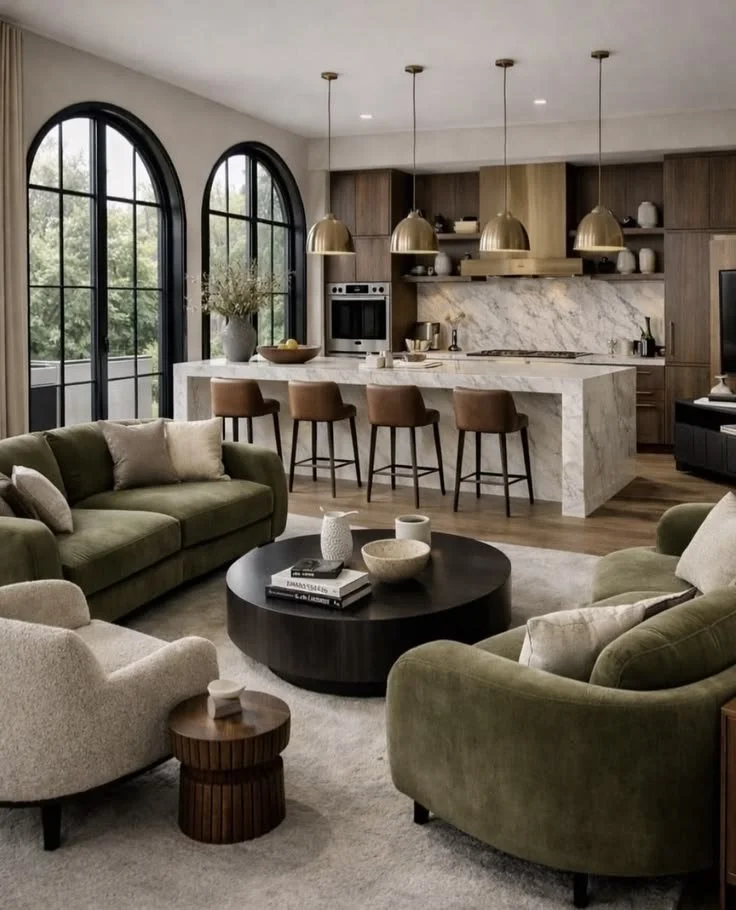
“Did Your Newly Built Space Come with Intense Black Trim and Sharp Metal Railings? Try This Simple ‘Visual Balance’ Trick to Make It Feel Instantly Warmer.”
Modern architecture feeling a bit too sharp or sterile? Discover 4 clever styling secrets to balance aggressive black window frames and stark metal railings with inviting, organic warmth.
Warm Contemporary: How to Ecase Stark Metal Railings and Black Trim with Organic Warmth
Let’s be completely honest for a second: there is an undeniable architectural power to the current building trends across the Pacific Northwest. When you tour the newly completed construction projects and luxury townhomes in Bellevue, Redmond, and Seattle, the visual impact is immediate. The sharp definition of black-framed windows, exposed steel supports, and stark metal railings creates an instantly sophisticated, cutting-edge aesthetic.
But once you settle into the space, a very real sensory challenge presents itself.
When your entire indoor environment is dictated by heavy, high-contrast industrial lines, the atmosphere can easily begin to feel a bit aggressive, rigid, or physically uninviting. Under our famously overcast regional skies, those sharp metallic perimeters can take on an institutional or cold mood. Instead of a relaxing retreat, your main floor plan can end up feeling a bit like a gallery where you are hesitant to truly get comfortable.
Because you are working with premium, unchangeable finishes or managing a high-end rental, painting over the black hardware or ripping out the steel railings isn’t an option. But you don't need to change the hardware to change the feeling of the home.
You can gracefully take the edge off those industrial surfaces and introduce an inviting, high-end warmth using clever, non-construction material choices.
Here are 4 designer-approved secrets to balancing heavy metal accents, introducing fluid depth to your layout, and creating a deeply comforting contemporary sanctuary.
1. Introduce Muted, Mid-Tone Earth Elements
The primary reason high-contrast industrial spaces feel cold is the lack of transitional shades. The visual jump from bright drywall directly to stark black steel is incredibly abrupt, which forces your eyes to register the room as a collection of sharp, separate fragments.
The Space-Planning Fix: Bridge that steep visual gap by peppering mid-tone natural elements throughout your primary furniture arrangements. Source consoles, accent tables, or shelving crafted from open-grain woods like light ash, honeyed walnut, or pale maple. These softer, intermediary earth tones act like a visual diplomat, absorbing harsh light reflections and softening the transition between the room's contrasting extremes without hiding the architecture.
2. Counteract Rigid Steel with Fluid, Rounded Forms
Industrial architecture operates almost exclusively on a strict grid of right angles and vertical bars. If you match that geometry by filling the floor plan with boxy, sharp-edged sofas and angular glass coffee tables, you create a layout that feels uncomfortably stiff.
The Style Shift: Intentionally break the geometric grid by weaving in soft, rolling contours. Swap out rigid centerpieces for a sculptural circular coffee table, rounded dining chairs, or an organic pebble-shaped ottoman. Introducing sweeping, curved outlines coaxes the eye to move fluidly through the room, neutralizing the aggressive feel of the iron railings and giving the whole space a relaxed, breezy movement.
3. Layer High-Density, Cloud-Like Textures
Flat surfaces amplify the echo and chill of metal and concrete. A room styled with smooth leather upholstery, flat woven rugs, and bare windows will make the industrial elements feel twice as loud because there are no soft dimensions to absorb the visual weight.
The Space-Planning Fix: Cushion the hard architecture by building a rich visual field out of deeply texturized, heavy fabrics. Layer your seating and windows with thick heathered wools, cloud-white chenille wraps, raw open-weave linen drapery, and rich matte micro-suedes. Incorporating these highly tactile, cozy textiles creates soft shadows and physical depth, making the entire living area feel instantly premium and deeply comforting.
4. Diffuse the Metal Glare with Organic, Textured Lighting
Relying entirely on standard, directional track lighting or cool-white ceiling spotlights will cast sharp, heavy shadow profiles down across your metal railings, emphasizing the clinical atmosphere of the building.
The Space-Planning Fix: Keep the harsh down-lights turned off when it's time to unwind. Instead, cultivate a layered network of ambient accent lighting positioned lower in the room. Scatter floor lamps and side table lamps featuring shades made from hand-loomed grasscloth, woven jute, or thick matte ceramic bases. Populate these fixtures with warm white LED bulbs. When lit, the light filters gently through the natural fibers, bathing your industrial walls in a soft, sunlit glow that blurs the room's rigid perimeters.
Balance Your Architecture with Soft Intention
True interior luxury isn't about fighting the clean, modern structure of your home's architecture—it’s about knowing how to gracefully complement those hard lines with comforting, organic movement. You don’t need to live through messy construction dust, break your budget, or alter a single piece of hardware to create a relaxing home. By fixing the visual flow, grounding your layout with beautifully curved furniture silhouettes, and layering warm natural textures, you can celebrate the clean sophistication of contemporary design while enjoying the absolute comfort of a cozy haven.
At Simply Bold Design, we specialize in luxury, non-construction room refreshes, custom spatial planning, and contemporary cosmetic upgrades across Seattle and the Eastside. We remove all the stress by delivering a personalized, beautifully detailed shopping list packed with clickable links to exclusive furniture and decor. You get a flawless, professional look executed seamlessly on your own terms.
Ready to soften your home's industrial lines and unlock its true potential? Book a Discovery Call with Simply Bold Design Today and let’s turn your space into a sunlit haven!
*Cover Photo is for inspiration from the internet!!
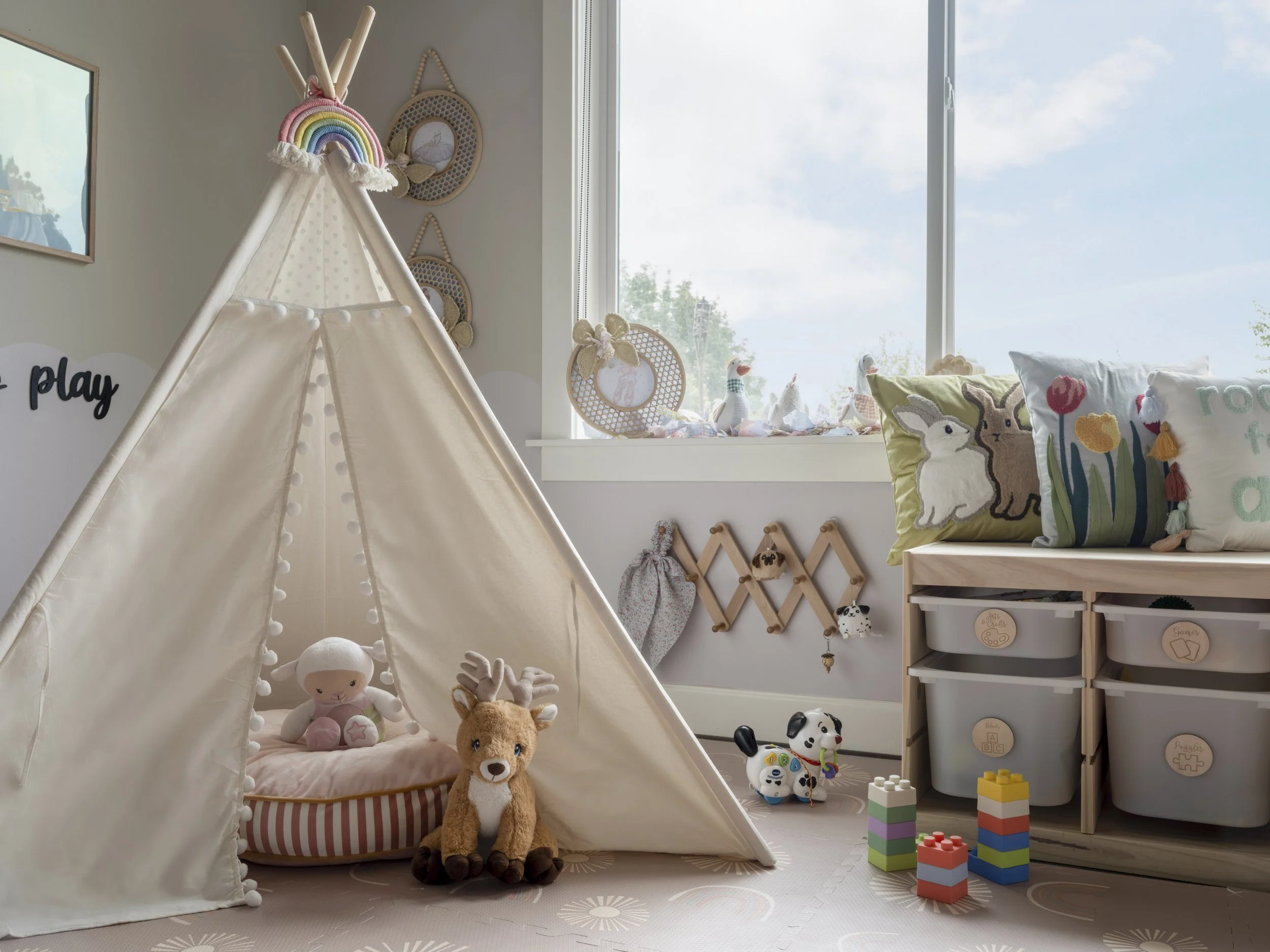
“Is Your Living Room Feeling a Little Too Taken Over by Toys? Try This Simple ‘Invisible Boundary’ Layout Trick to Win Back Your Grown-Up Sanctuary Every Evening.”
Toys taking over your main living area? Discover 5 non-construction space planning secrets to design a beautiful, cohesive layout that functions as an energetic daytime play zone and transforms into a sophisticated evening lounge.
The Family Pivot: Designing a Sophisticated Play Space and Lounge Combo in Sammamish
Let’s be completely honest for a second: raising a family across the Eastside is an absolute joy. Whether you are spending your weekends exploring the lakeside parks in Sammamish, hiking trails in Issaquah, or enjoying neighborhood block parties, our homes are the vibrant centers of active, bustling family structures.
But managing a household with young kids introduces a very real interior design dilemma: the living room takeover.
Your living room needs to serve as an energetic, safe daytime play zone where your children can create, imagine, and move freely. At the same time, when bedtime finally arrives, you desperately want that exact same room to transform into a calm, sophisticated, and clutter-free lounge area where you can relax, stream your favorite show, or host friends without stepping on a stray toy block.
The common misconception is that a family living room must sacrifice style, leaving you to surrender your personal aesthetic to a sea of bright plastic storage tubs. But you do not need to build custom playroom expansions to win back your space.
You can design a beautiful, multi-generational room that effortlessly shifts its identity from day to night using entirely non-construction space planning.
Here are 5 designer-approved secrets to crafting a high-end, kid-friendly living room combo layout that keeps your style polished, your children happy, and your sanity completely intact.
1. Establish "Invisible Boundaries" with Smart Rug Layouts
If you toss your kids' play mats, toy baskets, and small tables randomly across the center of your open-concept floor plan, the toys will visually bleed into your entire seating arrangement. This makes the main living footprint feel permanently cluttered.
The Space-Planning Fix: Create a defined layout by using separate area rugs to establish distinct functional islands on your floor. Ground your primary conversational seating area with a large, low-profile rug in soft ivory, cream, or warm sand tones. Then, carve out a specific corner or side zone for your kids and anchor it with a smaller, durable woven rug. This simple visual boundary tells your children exactly where their play zone lives, preventing toy sprawl from creeping into your evening relaxation area.
2. Swap Open Toy Tubs for Dual-Agent Hidden Furniture
Open toy boxes or clear plastic bins might be convenient, but they leave bright, colorful plastic toys completely on display, creating massive background visual noise that drains a room of its calming, luxury aesthetic.
The Style Shift: Transition your containment strategy into furniture that pulls double duty. Replace a traditional coffee table with a large, upholstered storage ottoman wrapped in high-performance neutral fabrics. Use deep, closed-door media consoles or side cabinets featuring clean wooden slatted finishes. These hidden storage compartments give you a massive, structured home to swallow up toys, books, and blankets in under two minutes flat before your evening relaxation begins.
3. Source Scratch-Resistant, High-Performance Textiles
If you are constantly policing your children around the furniture, hovering with stain removers, or covering your sofa in ugly blankets, your seating layout is causing unnecessary daily friction.
The Space-Planning Fix: Anchor your living room with high-end, commercial-grade performance fabrics (such as high-quality Crypton, tight-weave microfibers, or performance velvets). These fabrics are engineered to completely repel liquids, resist stains, and withstand the friction of active family life. Spills wipe up effortlessly with a damp cloth, allowing you to maintain a pristine, light-colored couch layout even with an energetic household.
4. Replace Sharp Edges with Organic Silhouettes
When children are running, playing, and learning to navigate a room, sharp, square coffee table corners or rigid rectangular metal side tables represent a daily safety hazard that keeps parents on high alert.
The Space-Planning Fix: Soften the room’s architecture by introducing rounded shapes into your furniture selections. Swap out rigid edges for a beautifully rounded wood coffee table or an organic-shaped pebble table. Curved profiles naturally guide traffic flow smoothly through the room, making modern townhomes and suburban homes feel much airier while allowing your little ones to move safely without compromising your high-end design aesthetic.
5. Transition the Mood with Layered Lighting
A family playroom requires bright, energized lighting to keep daylight flowing. However, leaving those same bright lights on during the evening keeps the room feeling like an active playground, making it difficult for your brain to wind down.
The Space-Planning Fix: Create a distinct shift in the room's energy when evening arrives by layering your lighting elements. Turn off the main overhead fixtures and turn on strategic floor lamps and side table lamps featuring hand-woven rattan or warm linen shades. Equipped with warm white LED bulbs, these textured lights filter the glow gently, casting soft, sunlit patterns across your walls. This creates a peaceful, cozy adult sanctuary that feels completely separated from the daytime bustle.
Honor Your Family, Protect Your Sanctuary
True interior luxury isn't about designing a fragile, unlived-in space where children are afraid to play. It’s about building a highly functional, resilient environment that beautifully supports the lives of everyone inside it. When you select high-performing materials, invest in hidden storage furniture, and create deliberate invisible layout zones, your living room can easily celebrate your family's joy by day and wrap you in absolute peace by night.
At Simply Bold Design, we specialize in luxury, non-construction room refreshes, custom spatial planning, and family-friendly cosmetic upgrades across Seattle and the Eastside. We remove all the stress by delivering a personalized, beautifully detailed shopping list packed with clickable links to exclusive furniture and decor. You get a flawless, professional look executed seamlessly on your own terms.
Ready to clear the toy clutter and unlock your living room's true potential? Book a Discovery Call with Simply Bold Design Today and let’s design a space the whole family loves!
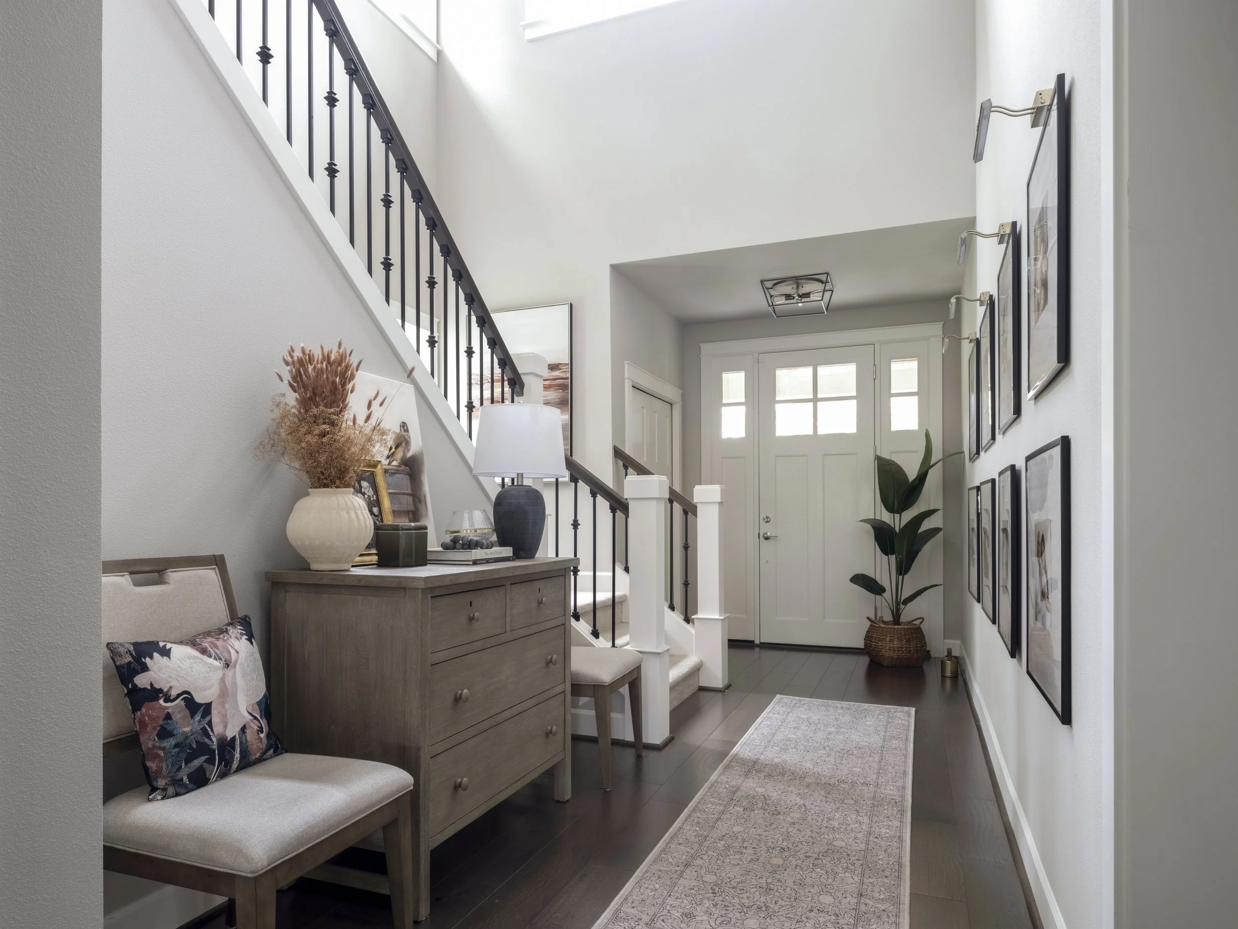
“Is a Dark, Narrow Hallway Making Your Home Layout Feel Enclosed? Try This Simple Multi-Frame ‘Breathing Room’ Grid to Instantly Open Up Your Corridors.”
Long hallway feeling like a dark, shadowy tunnel? Discover 4 clever, non-construction space planning secrets to transform awkward corridors into beautiful gallery transitions.
The Forgotten Pathway: Creative Layout Ideas for Long, Narrow Hallways
Let’s be completely honest for a second: when we map out our home décor updates, our attention almost automatically jumps straight to the major, high-profile zones. We invest our weekends into styling our living rooms, organizing our hybrid home offices, and ensuring our primary bedrooms look like luxury boutique hotels.
But as a result of that focus, our long, narrow hallways frequently become completely forgotten pathways.
Whether you are navigating a modern multi-story townhome in Bellevue, an urban apartment block in Seattle, or a spacious single-family layout in Kirkland, hallways claim a massive chunk of your interior real estate. Because these corridors are typically narrow and lack windows, they easily turn into dark, shadowy tunnels that siphon ambient daylight away from your main living areas. Leaving them blank makes your home transition feel unfinished, while shoving a heavy, bulky dresser into a tight walkway instantly ruins your traffic flow.
The common misconception is that an awkward corridor can’t be saved without an expensive structural remodel or cutting open walls to add windows. But you do not need a demolition crew to brighten a dark hallway.
You can completely transform these transition zones into beautiful, light-filled gallery experiences using deliberate, styling-only space planning.
Here are 4 designer-approved secrets to styling a long, narrow hallway, maximizing its visual width, and connecting your rooms with seamless warmth.
1. Ground the Pathway with a Soft, Low-Profile Runner Rug
An open, uncarpeted floor running down a fifteen-foot corridor acts like an acoustic megaphone, bouncing sound waves around the narrow walls and making the entire transition feel stark and institutional.
The Space-Planning Fix: Ground the entry path by rolling out an extra-long, low-profile washable runner rug. Opt for a high-quality vintage traditional pattern or a rich woven texture in soft ivory, cream, or warm sand tones. A beautiful runner acts like a visual highway on your floor plan. It instantly absorbs excess sound, conceals cold hardwood or plain carpeting, and introduces a soft, tactile layer that guides your feet comfortably through the home.
2. Build Architectural Depth with a Wide-Matted Frame Grid
When your hallway walls are long and completely bare, walking through the corridor accentuates the tight, narrow space, making the ceiling lines feel compressed. Trying to hang a giant, single horizontal canvas will only emphasize that long "bowling alley" look.
The Space-Planning Fix: Break up the linear monotony by hanging a repetitive series of smaller, identical frames in a clean horizontal row down one side of the wall. Choose light oak or matte gold borders, and use oversized off-white mat boards inside the frames. Framing your favorite travel maps, architectural sketches, or family moments with wide matting creates deep "breathing room." This tricks the eye into seeing architectural depth on the drywall, making the narrow corridor feel significantly wider.
3. Guide the Eye Horizontally with Upward Lighting Layers
Relying entirely on a row of harsh, downward-firing recessed ceiling spotlights or single flush-mount fixtures is the fastest way to turn a hallway into a gloomy cavern. Down-lighting shoots a strict cone of light straight onto your floors, casting heavy shadows across the upper walls and accentuating the narrow boundaries of the corridor.
The Space-Planning Fix: Pivot your lighting architecture to guide the human eye horizontally. Replace standard flush fixtures with low-profile, sleek vertical plug-in wall sconces that cast their primary light beams upward and downward along the wall's surface, or place a small cordless lamp on a floating shelf. Illuminating the drywall perimeters washes the entire hallway in a soft, sunlit glow, erasing dark corner shadows and visually pushing the narrow walls apart.
4. Create a "Virtual Window" with a Strategic End Mirror
When a long hallway simply dead-ends into a blank drywall partition or an enclosed closet door, the space feels abruptly cut off, giving the subconscious mind a subtle feeling of claustrophobia.
The Space-Planning Fix: Hang a large, beautifully framed round or square mirror at the absolute far end of the hallway, right at the terminal point of the corridor. Ensure the frame uses light natural wood or warm brass tones to match your lighting elements. The mirror acts like an architectural cheat code, capturing the ambient daylight flowing from the adjoining living spaces and bouncing it straight back down the corridor line, creating the gorgeous illusion of an open window and doubling the visual length of your home layout.
Connect Your Home with Pure Intention
A truly luxury home layout isn't defined by the shape of its hallways—it is defined by how intentionally you style the transitions between your spaces. Your narrow corridors are not dead space to be ignored; they are a magnificent canvas waiting for proper scale, texture, and visual balance. By grounding the floor with long runner rugs, bringing in wide-matted frame grids, and playing with upward ambient lighting layers, you can turn a forgotten hallway into a deeply cozy, light-filled feature of your home.
At Simply Bold Design, we specialize in luxury, non-construction room refreshes and custom spatial planning across Seattle and the Eastside. We remove all the stress by delivering a personalized, beautifully detailed shopping list packed with clickable links to exclusive furniture and decor. You get a flawless, professional look executed seamlessly on your own terms.
Ready to completely transform your home's narrow hallways? Book a Discovery Call with Simply Bold Design Today and let’s design an extraordinary space you love experiencing every single day!

“Is Your Modern High-Rise Apartment Feeling a Little Too Cold and Industrial? Try This Simple 3-Layer Texture Trick to Make Concrete Walls Feel Instantly Cozy.”
Living in a modern urban high-rise but fighting cold concrete walls and industrial finishes? Discover 4 styling secrets to layer high-impact textures and warm up your space without remodeling.
Softening the Steel: How to Make a Modern Concrete High-Rise Feel Cozy and Warm
There is an undeniable magic to high-rise living in the Pacific Northwest. When you step into a modern luxury condo or apartment in Downtown Seattle, South Lake Union, or Belltown, the sweeping city views, industrial floor-to-ceiling glass windows, and architectural exposed concrete pillars feel incredibly cutting-edge, vibrant, and sophisticated.
But urban architecture comes with a very common interior design side effect: it can feel structurally cold.
When you are surrounded by expansive gray concrete walls, dark industrial hardwood floors, and exposed steel ductwork, the environment can start to feel a little clinical or stark. Add in our famously beautiful, cloudy winter skies, and an unstyled high-rise can easily take on a chilly, shadowy mood that feels more like an upscale parking garage or an office block than an emotional, comforting sanctuary.
Because you are living under strict building guidelines or renting a premium unit, painting the concrete, drilling heavy structural anchors, or remodeling the floor plan is completely off the table. But you do not need to alter the architecture to banish the chill.
You can completely mask that cold, industrial stiffness and create an incredibly warm, deeply cozy home using entirely non-construction material choices.
Here are 4 designer-approved secrets to softening hard surfaces, infusing your modern high-rise with high-end warmth, and creating a sunlit-feeling urban nest.
1. Ground the Industrial Floor with a Thick, Low-Profile Rug
Exposed polished concrete or dark, hyper-smooth hardwood flooring looks incredibly sleek, but it acts like a giant visual mirror for cold light. Hard, uncarpeted floors bounce sound and amplify the chilly, sterile undertones of urban architecture.
The Space-Planning Fix: Ground your main conversational seating area with an oversized, low-profile area rug in soft ivory, warm cream, or sand tones. Look for a thick, luxurious woven wool or a subtle organic plush texture. A massive, light-colored rug acts like a canvas light-reflector right on your floor plan, pushing light upward against the concrete ceiling while instantly softening the room's acoustics and visual boundaries.
2. Introduce the Solar Warmth of "Sun-Drenched" Woods
When a space lacks natural structural warmth, filling it with more cold, reflective metals like chrome, brushed nickel, or black iron furniture will only amplify the clinical feel of the exposed steel beams.
The Style Shift: Bring natural warmth indoors through your primary furniture material selections. Swap out glass-and-metal coffee tables or dark-stained media consoles for light-toned natural woods like light oak, birch, or bamboo. These lighter, earth-toned finishes act like natural light-multipliers. They capture whatever ambient daylight filters through the city skyline and introduce an organic, tactile contrast that beautifully balances out the rigid concrete lines.
3. Layer High-Impact, Tactile Fabrics Like a Designer
When you are working within a modern layout with flat, hard surfaces, texture becomes your direct substitute for architectural warmth. A room with flat concrete, flat glass, and flat leather furniture will always feel cold because the human eye has absolutely nowhere soft to rest.
The Space-Planning Fix: Build an incredibly rich, multi-dimensional visual field using contrasting, plush textiles. Layer your sofa with chunky woven knit blankets, soft bouclé accent chairs, raw linen drapery panels, and rich velvet throw pillows. Mixing these highly tactile, soft fabrics creates gentle shadows and dimensional depths that make an industrial condo feel instantly premium, soft, and profoundly welcoming.
4. Banish the Chill with Golden Lighting Layers
Relying entirely on standard, cool-white recessed ceiling spotlights or track lighting fixtures is the fastest way to make an industrial high-rise feel like an art gallery after hours. To turn your apartment into a relaxing evening sanctuary, you need to transition your lighting layers.
The Space-Planning Fix: Keep the harsh overhead spotlights turned off when it's time to unwind. Instead, scatter a mix of sculptural floor lamps and side table lamps featuring hand-woven rattan, wicker, or warm linen shades. Equip every single lamp with warm white LED bulbs. When illuminated, the light filters through the natural, organic fibers, casting beautiful, textured sunlit patterns across your gray concrete walls and melting away the cold industrial shadows.
Fall in Love with the City View and the Cozy Interior
Your home should be an emotional refuge—a peaceful, inviting space that protects your well-being and recharges your energy at the end of a demanding schedule. You don’t need to live through a messy construction remodel, break your lease, or paint over your architectural concrete to escape the industrial chill. By fixing the sensory flow, grounding the layout with rich textiles, and layering warm ambient light, you can turn a cold concrete canvas into a luxury, sunlit urban haven.
At Simply Bold Design, we specialize in luxury, non-construction room refreshes, custom spatial planning, and renter-friendly cosmetic upgrades across Seattle and the Eastside. We remove all the stress by delivering a personalized, beautifully detailed shopping list packed with clickable links to exclusive furniture and decor. You get a flawless, professional look executed seamlessly on your own terms.
Ready to turn your industrial high-rise into a warm, cozy masterpiece? Book a Discovery Call with Simply Bold Design Today and let’s turn your space into a sunlit haven!
** the cover image is inspiration from Internet.
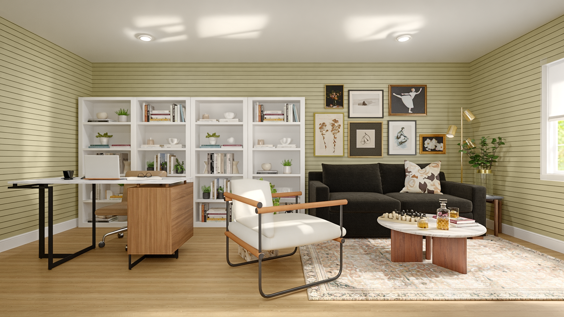
“Working From Your Living Room but Want Your Evenings Back? Try This Simple ‘Behind-the-Sofa’ Layout Trick to Hide Your Workspace in Plain Sight.”
Working from your living room but hate looking at computer monitors and messy cords during your evening downtime? Discover 4 styling secrets to carve out a hidden, functional home office nook without ruining your living room's relaxing aesthetic.
Hidden Productivity: Designing a Functional Work-From-Home Nook in a Multi-Purpose Living Room
Let’s be completely honest for a second: the flexibility of a hybrid or fully remote work schedule is one of the best parts of living and working across the Eastside. Whether you are hacking away at a tech project for a company in Redmond, managing accounts in Bellevue, or launching a creative startup in Seattle, cutting out the daily commute is a massive lifestyle win.
But remote work introduces a very real household space puzzle: the missing extra room.
Not everyone has an empty spare bedroom to dedicate exclusively to a home office. Many of us have to carve a functional workspace directly out of our main living room footprint. The challenge? When 5 PM rolls around and it's time to unwind, staring directly at a stark corporate computer monitor, a nest of black charging cords, and stacks of work notebooks makes it incredibly difficult for your brain to switch into relaxation mode. Your sanctuary suddenly feels like a corporate cubicle.
The common misconception is that a living room home office combo will always look messy, crowded, or disjointed. But you do not need to construct a new room to separate your work life from your resting life.
You can craft a "hidden productivity nook" that supports your highest career ambitions by day and completely disappears into a cozy oasis by night—using purely non-construction space planning.
Here are 4 designer-approved secrets to blending a highly functional home office into your multi-purpose living room layout while keeping the overall aesthetic beautifully calm.
1. Master the "Behind-the-Sofa" Floating Desk Layout
When trying to fit a desk into a living room, our natural instinct is to shove it into a dark corner or press it flat against a wall facing a blank drywall surface. This forces you to work facing away from the room, while leaving the back of your office chair sticking awkwardly out into your primary walking path.
The Space-Planning Fix: Pull your main sofa or sectional away from the wall and "float" it in the room. Then, place a long, slim-profile console desk directly against the back of the sofa, facing into the living space. This layout trick is an absolute game-changer. It keeps your workstation footprint compact and organized, allows you to enjoy the room's main view or natural daylight while you work, and uses the sofa's backrest as a natural visual boundary to anchor the office zone cleanly.
2. Swap Out the Corporate Office Chair for a Tailored Accent Chair
Nothing screams "cubicle" louder than a giant, black plastic mesh ergonomic desk chair on wheels sitting smack-center in a beautifully styled residential living room. It instantly breaks the color flow and visual warmth of your home.
The Style Shift: Swap out the clinical office chair for a low-profile, structured dining or accent chair featuring a curved silhouette and natural wood legs. Select upholstery wrapped in high-performing, cozy neutral textiles—like an ivory bouclé, soft camel velvet, or tight-weave sand linen. A beautifully tailored chair provides excellent ergonomic posture support during your meetings, but when tucked under the desk at night, it blends seamlessly into the room as an elegant accent piece.
3. Conceal the Cord Chaos Inside Closed Storage Units
A web of black monitor cables, power strips, and trailing chargers snaking across your floors or dangling beneath a desk will instantly cause background visual anxiety, shattering the luxury aesthetic of your living area.
The Space-Planning Fix: Keep your tech completely hidden in plain sight. Opt for a slim console desk that features built-in wire management gutters or a shallow drawer panel. For secondary tech gear like printers, backup drives, or router blocks, place a beautiful closed-door wooden media console or side cabinet directly adjacent to your desk footprint. Routing all wires cleanly inside closed cabinetry ensures that when you shut your laptop for the evening, your environment looks completely pristine and clutter-free.
4. Create an Intellectual Screen with Open-Back Bookshelves
If your desk setup sits along a side wall and you want a physical boundary that offers a bit more privacy during high-profile executive video calls, putting up a solid panel divider will block light and make a small condo feel dark and enclosed.
The Space-Planning Fix: Position a tall, open-back wooden or geometric metal bookshelf perpendicular to the wall, right between your workspace nook and your main lounge seating. Because it lacks a solid back panel, it allows ambient PNW light to filter through effortlessly from your windows, keeping the workspace energized. It serves as a sophisticated, airy visual screen that zones off your work center while showcasing light ceramics, framed quote boards, and green trailing plants.
Work Smart, Live Beautifully
Your home should be an emotional sanctuary that actively supports your daily lifestyle without forcing you to compromise on style or comfort. You don’t need to live through a messy construction remodel to achieve a healthy work-life balance. By fixing the visual flow, choosing multi-functional furniture with slim silhouettes, and hiding the tech clutter, you can enjoy a high-performing command center by day and a deeply peaceful haven by night.
At Simply Bold Design, we specialize in luxury, non-construction room refreshes, custom spatial planning, and clever storage upgrades across Seattle and the Eastside. We remove all the stress by delivering a personalized, beautifully detailed shopping list packed with clickable links to exclusive furniture and decor. You get a flawless, professional look executed seamlessly on your own terms.
Ready to completely transform your multi-purpose living room layout? Book a Discovery Call with Simply Bold Design Today and let’s design a space that works beautifully for you!
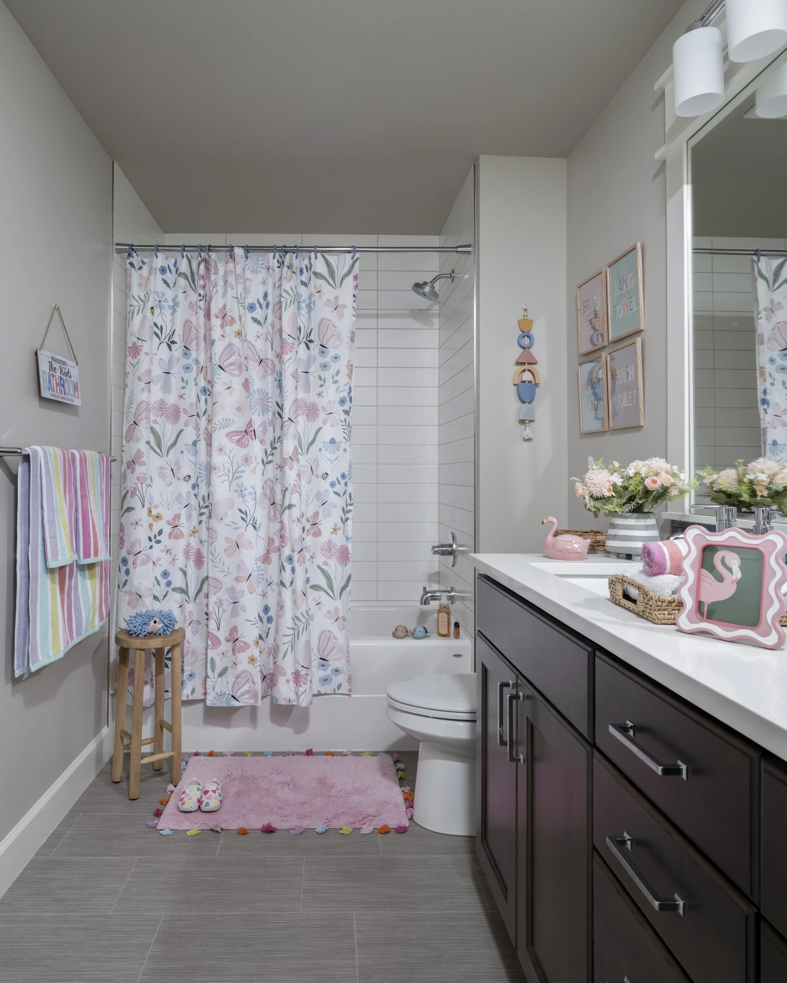
“Stuck with a Cold, Sterile Rental Bathroom? Try This Simple 3-Step Texture and Light-Reflecting Layout Trick to Create a Cozy Spa Oasis Without Changing the Tiling.”
Stuck with standard builder-grade finishes in your South Lake Union or downtown apartment? Discover 4 renter-friendly styling secrets to turn your bathroom into a luxury spa oasis without violating your lease.
Spa Day at Home: Renter-Friendly Cosmetic Upgrades for Luxury Seattle Bathrooms
Let’s be completely honest for a second: there is nothing quite like the feeling of waking up in a sleek high-rise condo in South Lake Union, Belltown, or downtown Seattle. You get those soaring city views, modern floor plans, and a front-row seat to the best energy in the Pacific Northwest. But urban luxury rentals often come with a very common, unchangeable compromise: the cold, sterile builder-grade bathroom.
When you walk into your bathroom, you are often greeted by a sea of uniform white subway tile, stark gray stone countertops, and harsh, clinical overhead fluorescent lighting. Because you are renting or living under strict property management guidelines, chipping away the tile, swapping out the vanity, or calling a plumbing contractor is completely out of the question.
As a result, a space that should be your private morning sanctuary and evening winding-down retreat ends up feeling a bit like a chilly hotel corridor. But you do not need a demolition crew to cultivate a relaxing atmosphere.
You can completely mask those clinical finishes and create an incredibly warm, five-star spa experience using entirely damage-free, styling-only design choices.
Here are 4 designer-approved secrets to transforming your rental bathroom into a cozy, luxurious sanctuary—all while keeping your security deposit perfectly safe.
1. Ground the Cold Floor with an Extra-Long Woven Bath Runner
Standard rental bathrooms feature cold porcelain tile or industrial concrete floors that instantly sap a room of its warmth. Dropping a tiny, basic white bath mat right outside the shower doesn't fix the visual field—it just breaks up the floor plan and makes the footprint feel smaller.
The Space-Planning Fix: Swap out small mats for an extra-long, plush washable bath runner rug that stretches down the full length of your vanity walkway. Choose a high-quality vintage traditional print or a thick, chunky knit texture in soft ivory, cream, or warm sand tones. A long runner rug acts like a giant canvas layout on your floor, completely concealing the uninspired tiling while introducing a soft, tactile cloud of comfort for your feet on chilly Seattle mornings.
2. Swap Out Sterile Plastic for Artisan Countertop Organizers
Nothing breaks a high-end spa aesthetic faster than clutter. When your daily skincare, toothbrushes, and wellness items are scattered across an open stone countertop, the visual background noise instantly triggers subconscious morning stress.
The Space-Planning Fix: Cleanse your surfaces by introducing matching countertop containers made from organic, warm materials. Group your daily essentials into small trays or boxes crafted from light natural oak, travertine stone, or hand-thrown ceramics. Tucking the visual noise into structured, earthy textures introduces an artisan layer that effortlessly counteracts the cold, clinical feel of industrial metal finishes and glass apartment hardware.
3. Layer the Atmosphere with Soft, Low-Profile Lighting
Relying entirely on a single bar of bright, cool-white overhead vanity lights is the fastest way to make your bathroom feel like an examination room. To signal to your brain that it is time to slow down and practice self-care, you need to soften your lighting layers.
The Space-Planning Fix: Keep the main overhead switch turned off when you want to relax. Instead, introduce a small, moisture-resistant cordless rechargeable table lamp or a backlit natural stone sconce onto a side shelf or counter corner. Equip it with a warm white LED bulb and choose a lamp with a frosted glass or warm linen shade. The soft, ambient glow casts gentle shadows across the room, mimicking a sunny morning and turning an ordinary evening bath into a peaceful sanctuary.
4. Upgrade the Visual Field with a Frame-Over-Mirror Layout
Many luxury rentals come equipped with massive, un-framed sheets of flat plate glass mirrors glued directly to the drywall above the sinks. While they help make the room look large, the lack of a border can feel unfinished, stark, and institutional.
The Space-Planning Fix: Give your mirror a high-end designer face-lift without removing it. Use an elegant, renter-friendly custom stick-on frame made from light natural wood or matte black borders that adheres directly onto the outer edge of your existing glass. Adding a structured frame instantly anchors the vanity zone, adds architectural depth to the wall layout, and transforms a basic apartment fixture into a deliberate, premium design statement.
Reclaim Your Daily Rituals
Your home should support your well-being at every turn, and your bathroom is exactly where your daily routines begin and end. You don’t need to knock down walls, alter pipes, or break your lease to escape the sterile gray. By fixing the sensory flow, grounding the floors with rich textiles, and layering warm ambient light, you can turn a basic rental layout into a luxury, sunlit spa retreat.
At Simply Bold Design, we specialize in luxury, non-construction room refreshes and renter-friendly cosmetic upgrades across Seattle and the Eastside. We remove all the stress by delivering a personalized, beautifully detailed shopping list packed with clickable links to exclusive furniture and decor. You get a flawless, professional look executed seamlessly on your own terms.
Ready to turn your rental bathroom into a peaceful spa masterpiece? Book a Discovery Call with Simply Bold Design Today and let’s make your design dreams a reality!
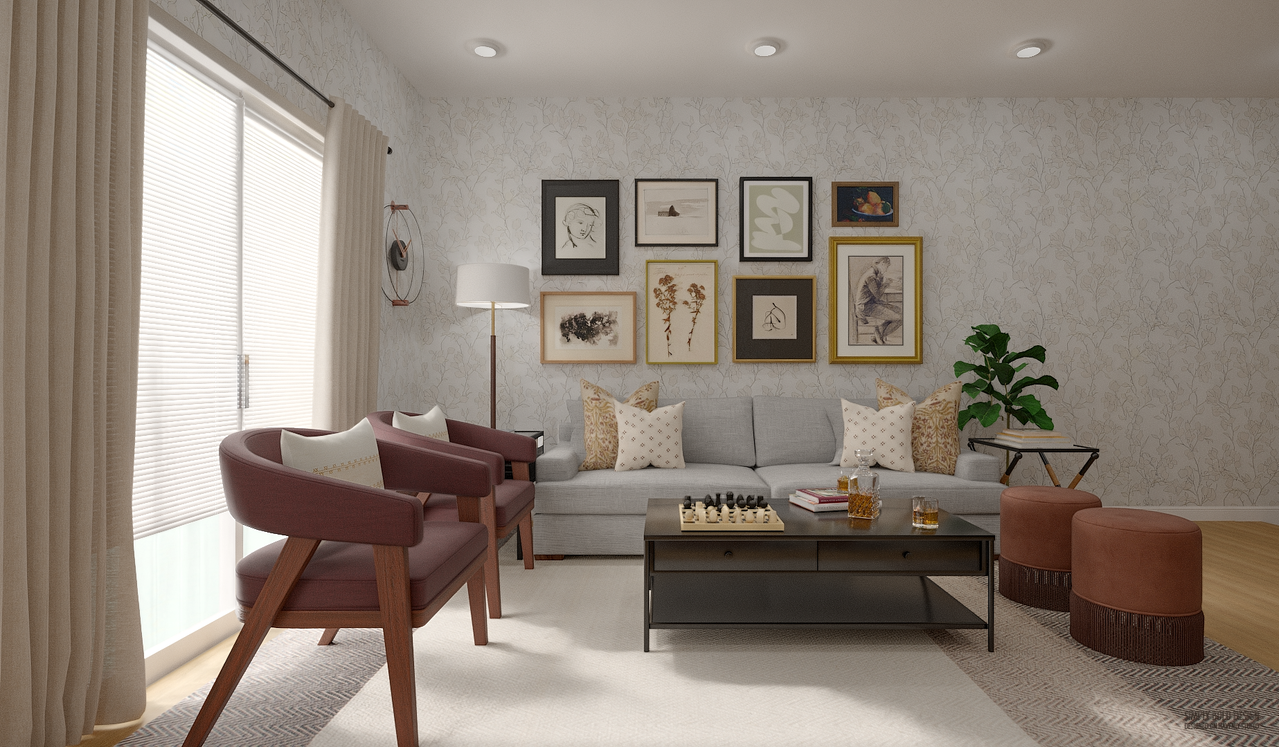
“Staring at a Massive Empty Wall in Your Living Room? Try This Asymmetrical ‘Breathing Room’ Grid to Balance Your Space Without Clutter.”
Staring at an enormous, intimidating empty wall in your open-floor plan? Discover 4 high-impact, non-construction styling secrets to balance massive blank walls beautifully without clutter.
The Great Wall: 4 Creative Ways to Style a Massive, Blank Living Room Wall
There is a lot to love about the expansive, airy feeling of open-concept living. When you walk into a newly built home or a spacious townhome in Kirkland, Bellevue, or Seattle, those grand proportions feel immediately luxurious. But open architecture often introduces a very intimidating design challenge: the giant, uninterrupted blank wall.
When a single wall stretches for twenty feet across your combined living and dining footprint, deciding how to decorate it can cause instant design paralysis. If you leave it completely empty, your room can feel echoing, unfinished, and a bit like a cold art museum gallery. But if you try to fill it by hanging a scattering of tiny, random picture frames, you end up creating massive visual noise that makes the whole floor plan feel cluttered and chaotic.
The common misconception is that a large wall demands heavy, permanent construction upgrades—like building expensive custom built-in cabinetry or putting up dark wood paneling. But you don't need construction tools to anchor a large space.
You can completely balance your grandest walls and infuse them with high-end warmth using clever, non-construction styling strategies.
Here are 4 designer-approved secrets to styling a massive blank wall, bringing scale and cohesion to your open floor plan while keeping the overall aesthetic beautifully calm.
1. Master the Multi-Frame Asymmetrical Grid
When faced with a giant stretch of drywall, trying to center one single piece of standard-sized artwork can make the frame look tiny and lost against the vast architecture. To balance a big wall, your decor footprint needs to match the scale of the room.
The Space-Planning Fix: Create a structured layout using an asymmetrical grid of multiple matching frames. Choose high-quality abstract prints, architectural linework, or vintage world maps, and frame them uniformly in light natural oak or matte gold borders. The key designer secret here is using oversized off-white mat boards inside the frames. Wide matting creates deep "breathing room" around the art, which lets the display look expensive, structured, and expansive without overwhelming your eyes with too much color.
2. Introduce the Three-Dimensional Magic of Floating Shelves
A common mistake when styling a large wall is keeping everything completely flat against the drywall. Hanging only flat canvases or paper prints over a twenty-foot span highlights the room’s length but leaves the wall feeling thin and lacking physical depth.
The Space-Planning Fix: Break up the flat surface by installing one or two thick, chunky solid wood floating shelves (like rich walnut or light oak) running horizontally along a section of the wall. Because the shelves project forward into the room, they instantly introduce actual dimensional depth. Use them to style an intentional, low-profile mix of hardcover design books, light ceramic stoneware vases, and your signature white floating concealment storage shelves. This adds rich texture and high utility while keeping daily items hidden entirely out of plain sight.
3. Layer Your Sightlines with a Low, Enclosed Console Table
If your large wall is completely bare from the baseboards to the ceiling, the vertical space can feel incredibly stark, throwing off the proportions of your conversational seating area.
The Space-Planning Fix: Ground the entire wall by placing a long, low-profile enclosed console table along the base of the drywall. Look for a design featuring clean wooden slatted doors or a textured linen finish with closed cabinetry to completely hide trailing tech wires and devices. Placing a long piece of furniture at the bottom grounds the visual field. It gives you a beautiful platform to style a warm table lamp or lean an oversized floor mirror, bridging the gap between your floor plan and your high ceilings.
4. Bring in the Living Softness of Real Preserved Greenery
Large expanses of plain white or gray drywall can easily start to feel sterile under our classic Pacific Northwest overcast winter skies. Adding more flat paper prints can sometimes feel rigid if you don't introduce an organic element to soften the architecture. [1]
The Space-Planning Fix: Introduce actual nature directly onto the wall's surface. Dedicate a section of your gallery layout to a 3D framed preserved moss art panel or a set of glass floating frames featuring pressed botanical green leaves (like real fern or eucalyptus leaves). Bringing physical, preserved flora onto a massive wall softens the room's hard corporate lines, introduces a vibrant splash of natural color, and creates a deeply soothing, welcoming environment.
Scale Your Home with Pure Intention
A beautiful open floor plan shouldn't feel intimidating or cold. Your largest walls are not a problem to be solved—they are a magnificent blank canvas waiting for proper scale, texture, and visual balance. By anchoring the baseline with long furniture, bringing in three-dimensional shelf depth, and playing with wide-matted frame grids, you can make your grandest rooms feel beautifully proportioned, cohesive, and incredibly cozy.
At Simply Bold Design, we specialize in luxury, non-construction room refreshes and custom spatial planning across Seattle and the Eastside. We remove all the stress by delivering a personalized, beautifully detailed shopping list packed with clickable links to exclusive furniture and decor. You get a flawless, professional look executed seamlessly on your own terms.
Ready to completely transform your living room's blank walls? Book a Discovery Call with Simply Bold Design Today and let’s design an extraordinary space you love coming home to!
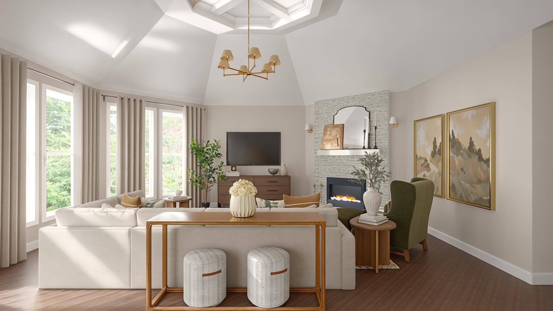
“Does Your Living Room Floor Plan Feel a Little Compressed? Try This Simple Vertical Drapery Trick to Make Your Ceilings Look Twice as Tall.”
Ground floor of your Seattle townhouse feeling a little compressed? Discover 4 styling secrets to visually lift low ceilings and make your room feel tall, bright, and airy without calling a contractor.
Soaring High: How to Make Low Townhome Ceilings Feel Twice as Tall Without Construction
Living in a multi-story townhome or a classic neighborhood property in Seattle, Bellevue, or Redmond comes with so many perks. You get distinct levels for working and sleeping, clever architectural zoning, and great vertical views. But vertical architecture often introduces a very common structural compromise: lower ceiling heights on the main living floor.
When builders have to pack multiple stories into local height restrictions, the ground floor or main lounge area can sometimes max out at a standard eight feet. If your main living footprint is already compact or slightly dark due to our classic Pacific Northwest overcast skies, a low ceiling can make the entire room layout feel a bit compressed—almost like the ceiling is gently pushing down on the space.
The natural impulse is to think that the only way to get a grand, airy feeling is to live through a major structural renovation or buy a home with soaring double-height rafters. But you don't need to change the architecture to change the atmosphere.
You can completely cheat the eye and create the illusion of soaring height using strategic, styling-only space planning.
Here are 4 designer-approved secrets to visually lifting low ceilings, opening up your vertical volume, and making your home layout feel instantly tall, bright, and expansive.
1. Hang Your Drapery at "Floor-to-Ceiling" Heights
One of the most common layout mistakes that cuts a room’s height in half is hanging curtain rods directly above the window frame. When your drapery starts right at the window glass and ends at the floor, it creates a visual line that anchors the eye low, emphasizing the exact point where the window stops.
The Space-Planning Fix: Mount your curtain rods completely out of the standard zone—aim for just 2 to 3 inches below the ceiling line. Ensure your drapery panels are long enough to sweep all the way down to touch the floor. By extending the fabric from the absolute highest point of the wall to the absolute lowest, you create an unbroken vertical stripe of texture. This tricks the brain into assuming the windows—and the ceilings—are feet taller than they actually are.
2. Guide the Eye Upward with Vertical Lighting Layers
If the only light source in your low-ceilinged living room is a single flush-mount ceiling fixture or a grid of recessed down-lights, the layout will always feel visually compressed. Down-lighting pushes a heavy shadow profile onto your floors, leaving the top third of the room completely dark and calling attention to the lower ceiling.
The Space-Planning Fix: Pivot your lighting architecture to guide the human eye upward. Install sleek vertical plug-in wall sconces that cast their primary light beams upward, or use tall, slender floor lamps that wash light across the ceiling. Illuminating the upper perimeter of the room erases heavy shadows and visually "lifts" the ceiling, making the whole floor plan feel instantly airier.
3. Shift Toward Low-Profile, Elevated Furniture
Bulky, high-backed sofas, massive heavy dressers, and chunky overscale furniture items claims too much vertical real estate in a low-ceilinged room. When furniture sits close to the ceiling line, the remaining "empty space" above it shrinks, making the layout feel crowded and small.
The Space-Planning Fix: Keep the visual weight of your furniture close to the ground. Opt for a low-profile sectional or sofa with clean, horizontal lines, and look for accent chairs that sit on slim, elevated legs. Leaving more open air space between the top of your furniture and the ceiling instantly expands the vertical volume of your room, allowing light to travel freely across your layout.
4. Create an Elevated Focal Point with Slender Art Frames
When you are selecting your wall decor for a low-ceiling floor plan, traditional wide, horizontal canvas frames can visually slice your walls in half, accentuating the room's short height.
The Space-Planning Fix: Arrange your artwork to emphasize vertical length instead of horizontal width. Group your favorite abstract prints or global travel maps in a vertical column layout (stacking two or three frames neatly on top of each other). Use slender light oak or matte black frames paired with wide, off-white mat boards. This layout naturally forces the eye to track from the baseboard to the ceiling, giving your walls a long, graceful, and sophisticated appearance.
Honor Your Architecture, Elevate Your Flow
A truly luxury home layout isn't defined by its structural measurements—it is defined by how intentionally you style the space you have. When you clear out the horizontal shadows, adjust your lighting directions, and lift your textile lines, you can completely escape that enclosed feeling and enjoy a tall, sunlit-feeling sanctuary every single day.
At Simply Bold Design, we specialize in luxury, non-construction room refreshes and custom spatial planning across Seattle and the Eastside. We remove all the stress by delivering a personalized, beautifully detailed shopping list packed with clickable links to exclusive furniture and decor. You get a flawless, professional look executed seamlessly on your own terms.
Ready to make your low ceilings feel soaring and bright? Book a Discovery Call with Simply Bold Design Today and let’s turn your space into a perfectly proportioned, stylish haven!
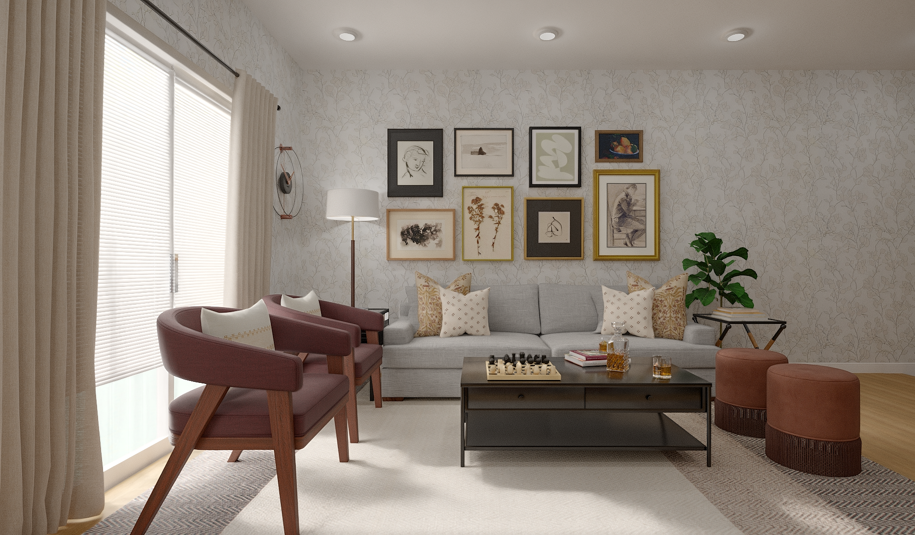
“Hosting Overnight Family But Don’t Have a Spare Bedroom? Try This Low-Profile Invisible Layout Strategy to Turn Your Living Room into a Temporary Luxury Suite.”
No extra spare room for out-of-town visitors? Discover 4 clever, non-construction space planning secrets to effortlessly spin up a luxury guest oasis right inside your main living area.
The Invisible Guest Room: Faking a Luxury Overnight Space When You Don’t Have a Spare Bedroom
Let’s be completely honest for a second: living in the heart of the city is an absolute dream. Coming home to a sleek, modern condo in South Lake Union, a historic apartment in Capitol Hill, or a light-filled high-rise in downtown Seattle means you are steps away from incredible culture, dining, and views.
But urban living comes with a very common square-footage reality check: the missing guest bedroom.
When out-of-town family or long-time friends announce they are visiting the Pacific Northwest, a wave of subtle hospitality anxiety can easily set in. You want to offer them a warm, deeply comfortable, five-star hotel experience, but you don't have a dedicated guest suite behind a closed door. The common misconception is that hosting visitors in a compact floor plan means forcing them onto an uncomfortable, noisy air mattress on the living room floor, or cluttering up your main relaxation space with cheap fold-out cots.
But you do not need an extra bedroom to offer a luxury stay.
You can craft an "invisible guest room" that serves as a beautiful, high-functioning social hub by day and transforms seamlessly into an upscale, private sleeping oasis by night—using purely non-construction furniture choices.
Here is the exact designer blueprint to help you maximize your space planning and fake a luxury guest suite right inside your main living area layout.
1. Anchor the Room with an Elevated Sleeper Sectional
Your main sofa claims the largest chunk of real estate in your living area, making it the ultimate tool for spatial flexibility. If your current couch is a rigid, low-profile block, it can't adapt to accommodate overnight visitors.
The Space-Planning Fix: Upgrade your lounge area with a premium, tailored upholstered sleeper sectional wrapped in high-performing neutral fabrics like soft ivory or warm sand linen. Modern luxury sleepers completely skip the uncomfortable metal coils of the past, utilizing seamless memory foam or thick latex block pull-outs. During the workweek, it frames a pristine, sophisticated seating area; at night, it converts smoothly into an expansive, incredibly cozy bed that sits level with your design aesthetic.
2. Swap Traditional End Tables for Mobile Storage Ottomans
Fixed, heavy wooden end tables and boxy side consoles block your footpaths, making it incredibly difficult to reconfigure a room's footprint when it's time to open up a sleeper bed.
The Space-Planning Fix: Shift your layout accents toward multi-functional, lightweight storage ottomans. Choose rounded or structured rectangular designs with hidden storage compartments beneath the lids. These serve as beautiful, family-friendly coffee tables or footrests during the day. When guests arrive, they easily glide out of the main traffic lanes to act as cozy bedside nightstands, providing visitors with a discreet place to set down their phones or reading glasses.
3. Layer the Lighting for a Peaceful Evening Transition
A main living room layout is typically illuminated to feel energetic, bright, and social. But when your guests wind down for the night, leaving them to sleep under standard overhead recessed lighting can feel exposed and clinical.
The Space-Planning Fix: Introduce customizable, horizontal layers of light to completely alter the room's energy. Turn off the main ceiling fixtures and populate your corners with tall floor lamps that bounce light softly against the ceiling. Place a small lamp featuring a hand-woven rattan or warm linen shade on a nearby shelf or side console. Equipped with warm white LED bulbs, these textured lights cast a soft, sunlit pattern across the walls, mimicking a cozy evening fireplace and signaling to your guests that it is safe to deeply relax.
4. Hide Guest Linens in Plain Sight
One of the hidden challenges of hosting in an open floor plan is where to store extra luxury bedding, plush pillows, and fresh bath towels without crowding your primary bedroom closets.
The Space-Planning Fix: Conceal the guest kit in plain sight inside your living room architecture. Choose a closed-door media console table with deep cabinetry, or slide two beautiful, large woven baskets with fitted lids directly underneath a slim perimeter console table. Stashing the extra sheets, blankets, and pillows inside high-end decorative containers keeps your home entirely clutter-free, while ensuring your guests can access their nighttime items effortlessly without needing to ask.
Welcome Your People with Intentional Design
True interior luxury isn't about the size of your home or the number of doors on your floor plan. It’s about how intentionally you style the space you have to support the people you love. By selecting smart, multi-functional furniture, layering your lighting environment, and clearing out the visual shadows, you can celebrate the close-knit beauty of urban city living while offering a five-star hotel escape to your favorite travelers.
At Simply Bold Design, we specialize in luxury, non-construction room refreshes, clever space planning, and small-space cosmetic upgrades across Seattle and the Eastside. We remove all the stress by delivering a personalized, beautifully detailed shopping list packed with clickable links to exclusive furniture and decor. You get a flawless, professional look executed seamlessly on your own terms.
Ready to completely transform your urban condo layout? Book a Discovery Call with Simply Bold Design Today and let’s craft a space that works beautifully for you and your guests!
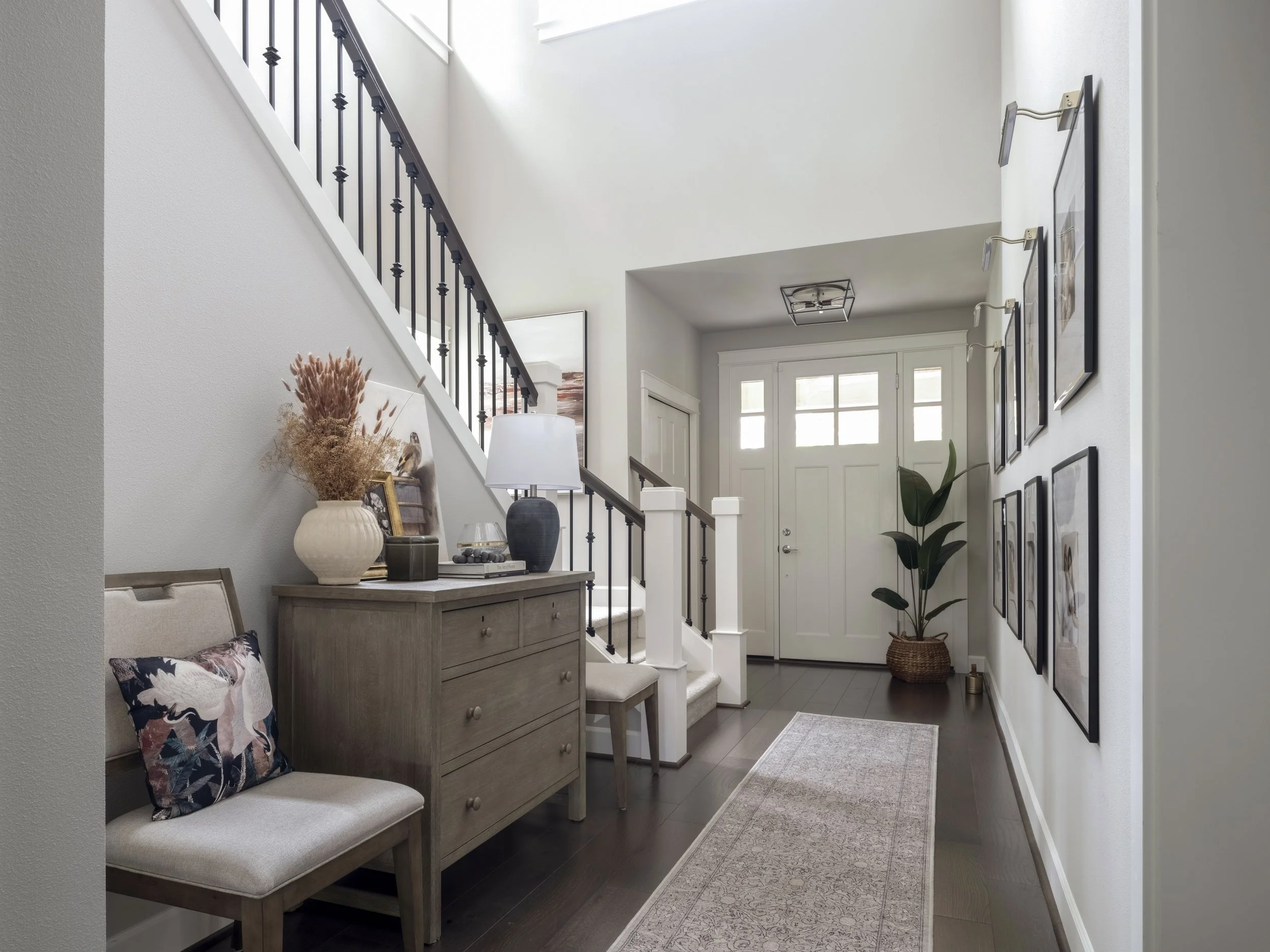
“Have an Empty Corner Between Floors in Your Townhome? Try This Simple, Low-Profile Layout Trick to Turn an Awkward Landing into a Cozy, Useful Space.”
Dealing with a tight, empty landing strip between floors in your Redmond townhome? Discover 4 functional, non-construction styling tricks to transform awkward staircase nooks into purposeful, beautiful spaces.
The Multi-Story Landing: How to Style Awkward Staircase Nooks in Your Redmond Townhome
There is so much to love about the modern townhome architecture popping up all over Redmond, Bellevue, and the Eastside. The clean vertical lines, the separation of bedrooms from living areas, and those sweeping rooftop views are fantastic. But vertical living introduces a very specific design puzzle that flat, single-story floor plans don't face: the awkward staircase landing.
As you walk up and down the stairs, you are often greeted by small, narrow pockets of square footage between floors. Because these nooks are usually too tight for standard furniture, they easily become dead visual spaces—or worse, accidental drop-zones where laundry baskets, empty Amazon boxes, and random clutter go to hide.
Pusshing a bulky dresser into a tight walkway will crowd your traffic lane, and leaving it completely blank makes your home feel incomplete. But you do not need to live with dead space.
You can reclaim your stair landings and turn them into beautiful, highly functional micro-zones using a few clever, low-profile styling tricks.
Here is the exact designer blueprint to transform your awkward staircase nooks into purposeful, cozy extensions of your home without changing a single wall.
1. Anchor the Nook with a Slim-Profile Console Table
The secret to styling a narrow landing is choosing furniture that provides surface space without extending forward into your walking path. Standard tables stick out too far, creating a constant bumping hazard.
The Space-Planning Fix: Introduce an ultra-slim console table—ideally one that is only 10 to 12 inches deep. Look for a design with open, elevated legs or floating wall brackets. An open, leggy silhouette lets ambient light travel underneath, preventing the tight corner from feeling heavy. It gives you a pristine surface to display a small ceramic vase or a favorite book while keeping the physical walkway completely clear.
2. Introduce Warmth with a Small, Cordless Table Lamp
Because staircase nooks are tucked away in the center core of multi-story townhomes, they are often completely windowless. Relying strictly on harsh, recessed ceiling spotlights can make these transition areas feel cold, clinical, and shadowy at night.
The Space-Planning Fix: Place a small, beautiful cordless rechargeable table lamp on your slim console table. Look for a lamp featuring a hand-woven rattan, wicker, or soft linen shade. When evening falls, turning on this ambient light casts a soft, textured, sunlit pattern across the drywall. It instantly transforms a dark, functional stairwell into a warm, inviting pathway that connects your floors seamlessly.
3. Take Advantage of Under-Table Hidden Storage
An empty landing is a golden opportunity to add storage to your home layout, but it must be completely hidden to preserve a clean, premium aesthetic.
The Space-Planning Fix: Slide one or two matching woven storage baskets with fitted lids directly underneath your slim console table. These baskets act as a stylish, structured containment system. They give you a designated home to tuck away out-of-season cold-weather gear, extra linens, or extra household supplies entirely out of sight, resetting the room's energy in seconds.
4. Create an Intellectual Visual Frame
When you are moving between distinct levels of your home—like transitioning from a high-energy home office down to a relaxing living room—the walls of your staircase can feel vast and empty if left unstyled.
The Space-Planning Fix: Use the wall directly above your landing console to create an intentional visual anchor. Hang a high-quality abstract art print, a vintage world map, or a beautiful texturized linen quote board framed in light oak wood. Ensure the frame uses wide, off-white matting to create "breathing room." This draws the eye forward as you walk down the stairs, visually widening the narrow landing and making the vertical transition feel like a curated gallery experience.
Reclaim Every Corner of Your Home
A truly elevated home isn't just about having a stunning living room; it’s about ensuring that every single pocket of your floor plan feels intentional, cared for, and harmonious. When you bring light, purpose, and clever layout structure to your awkward staircase landings, your entire home's flow shifts, turning a functional transition into a deeply cozy detail.
At Simply Bold Design, we specialize in luxury, non-construction room refreshes, custom spatial planning, and high-impact storage layouts across Seattle and the Eastside. We remove all the stress by delivering a personalized, beautifully detailed shopping list packed with clickable links to exclusive furniture and decor. You get a flawless, professional look executed seamlessly on your own terms.
Ready to completely transform your townhome's dead spaces? Book a Discovery Call with Simply Bold Design Today and let’s design a space you love experiencing every single day!
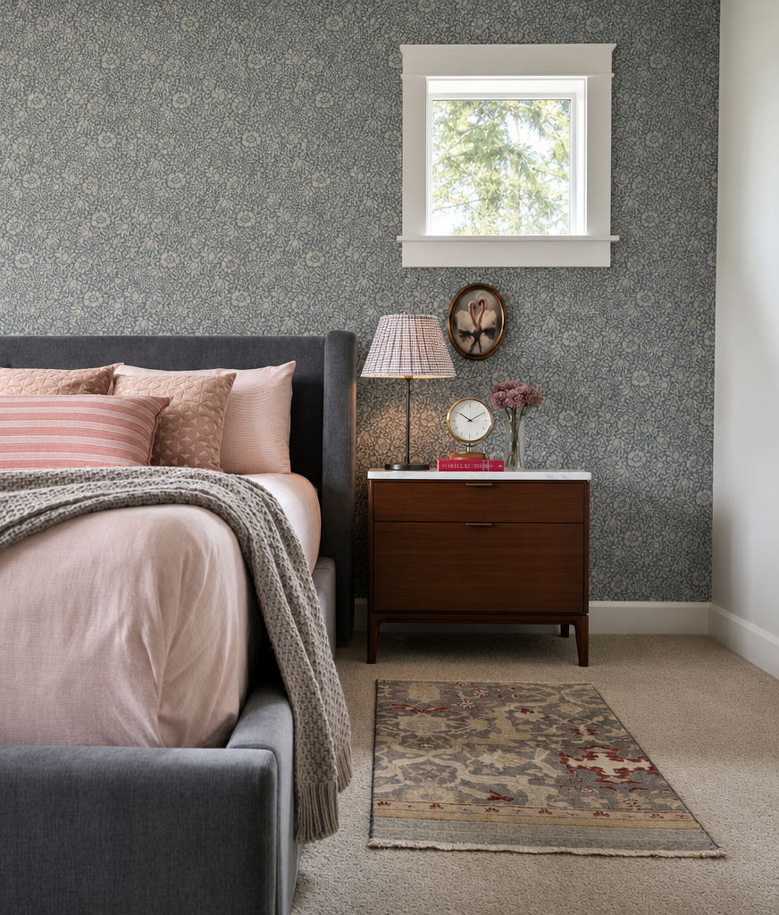
“Is Your Bedroom Feeling a Little Neglected? Try This Gentle 4-Week Styling Blueprint to Turn Your Space into a Cozy, Five-Star Hotel Retreat.”
Spend all your energy styling your living areas while your bedroom feels neglected? Discover how to design a five-star hotel vibe in your Bellevue rental or home in just four weeks.
The 4-Week Bedroom Reset: Designing a Five-Star Hotel Vibe in Your Bellevue Rental
Let’s be completely honest for a second: when we decide to refresh or style our homes, our primary focus almost always goes straight to the public spaces. We spend our weekends meticulously arranging our living rooms, perfecting our hybrid home offices, and organizing our entryways so everything looks flawless for visiting guests or busy family schedules.
But as a result of that focus, our primary bedrooms often become an afterthought. It easily becomes the room where we store extra laundry baskets, stash unorganized boxes, or leave blank, cold walls because "no one else is going to see it anyway."
Living in fast-paced tech and business hubs like Bellevue and across the Eastside means our days are filled with high-intensity schedules. If the final space you retreat to at night feels uninspired, cluttered, or cold under our gray Pacific Northwest winters, your mind never truly gets the chance to recharge.
Your bedroom shouldn't just be a place where you sleep—it should be an emotional sanctuary that feels like checking into a luxury boutique hotel.
The good news is that you don’t need to live through a messy structural remodel, hire a construction crew, or violate a luxury lease to achieve that high-end resort feeling. You can completely reset your bedroom in just four weeks using an intentional, styling-only design blueprint.
Here is the step-by-step designer framework to turn your primary bedroom into a warm, deeply relaxing, and sophisticated sanctuary.
Week 1: Anchor the Bed Layout with Tailored Proportions
A true five-star hotel room always begins with a commanding focal point: the bed. If your current setup features a low-profile mattress resting on a basic metal frame with an off-scale headboard, the entire room can feel visually unanchored and cold.
The Space-Planning Fix: Elevate the entire footprint of the room by investing in a tall, fully upholstered headboard or bed frame wrapped in premium, high-performing neutral fabrics like tight-weave linen, bouclé, or soft camel velvet. Choosing a bed frame with structured, clean lines instantly establishes a sense of high-end permanence and architectural safety behind your head, making the room feel grounded from day one.
Week 2: Layer Textures Like a Luxury Resort
If your bed is dressed in a single, flat comforter or a slick sheet set with no depth, it will visually flatten the room's energy. Luxury hotels feel cozy because they master the art of tactile, multi-dimensional textile layering.
The Space-Planning Fix: Build a rich visual field on your mattress using contrasting organic materials. Start with crisp, high-thread-count white or ivory base sheets. Layer on a thick, fluffy duvet cover, and top the foot of the bed with a chunky woven or heavy waffle-knit blanket in a warm neutral tone like soft taupe or sand. Finish the look with a mix of structured linen shams and velvet accent pillows. Mixing these textures creates soft, inviting shadows that make you want to instantly dive in and relax.
Week 3: Frame the Layout with Enclosed Nightstands
Open-legged nightstands or small side tables that leave phone cords, reading glasses, and books exposed contribute heavily to subconscious visual anxiety right before you close your eyes.
The Space-Planning Fix: Swap out open shelving for solid, enclosed bedside tables that feature deep drawers or clean cabinetry finishes. This gives you a quiet, discreet containment zone to tuck away daily clutter and electronics. Ensure the nightstands are wide enough to match the proportions of your bed layout, creating a balanced symmetry that mimics a luxury suite.
Week 4: Elevate the Mood with Warm, Golden Light Layers
Relying entirely on a harsh, single overhead ceiling light fixture is the fastest way to flatten a bedroom's atmosphere and make it feel clinical. To signal to your brain that it is time to slow down, you need to transition your lighting layers.
The Space-Planning Fix: Strictly avoid cool, blue-white lightbulbs in your sleeping sanctuary. Equip your nightstand lamps with warm white LED bulbs. Look for lamps featuring hand-woven rattan shades, warm linen panels, or solid marble bases. When illuminated, the light filters through the natural, organic fibers, bathing your walls in a gorgeous, climbing golden glow that completely counters the moody Seattle gray outside.
Invest in Your Peace of Mind
At the end of the day, designing a beautiful primary bedroom isn’t about impressing anyone else—it is a direct investment in your own mental health, restful sleep, and daily well-being. When you clear out the visual noise, fix the physical flow, and wrap your space in warm, luxurious natural materials, your entire mindset shifts the moment you cross the threshold.
At Simply Bold Design, we specialize in luxury, non-construction room refreshes, custom furniture layouts, and renter-friendly cosmetic upgrades across Seattle and the Eastside. We remove all the stress by delivering a personalized, beautifully detailed shopping list packed with clickable links to exclusive furniture and decor. You get a flawless, professional look executed seamlessly on your own terms.
Ready to completely transform your bedroom into a five-star retreat? Book a Discovery Call with Simply Bold Design Today and let’s craft the peaceful sanctuary you deserve!
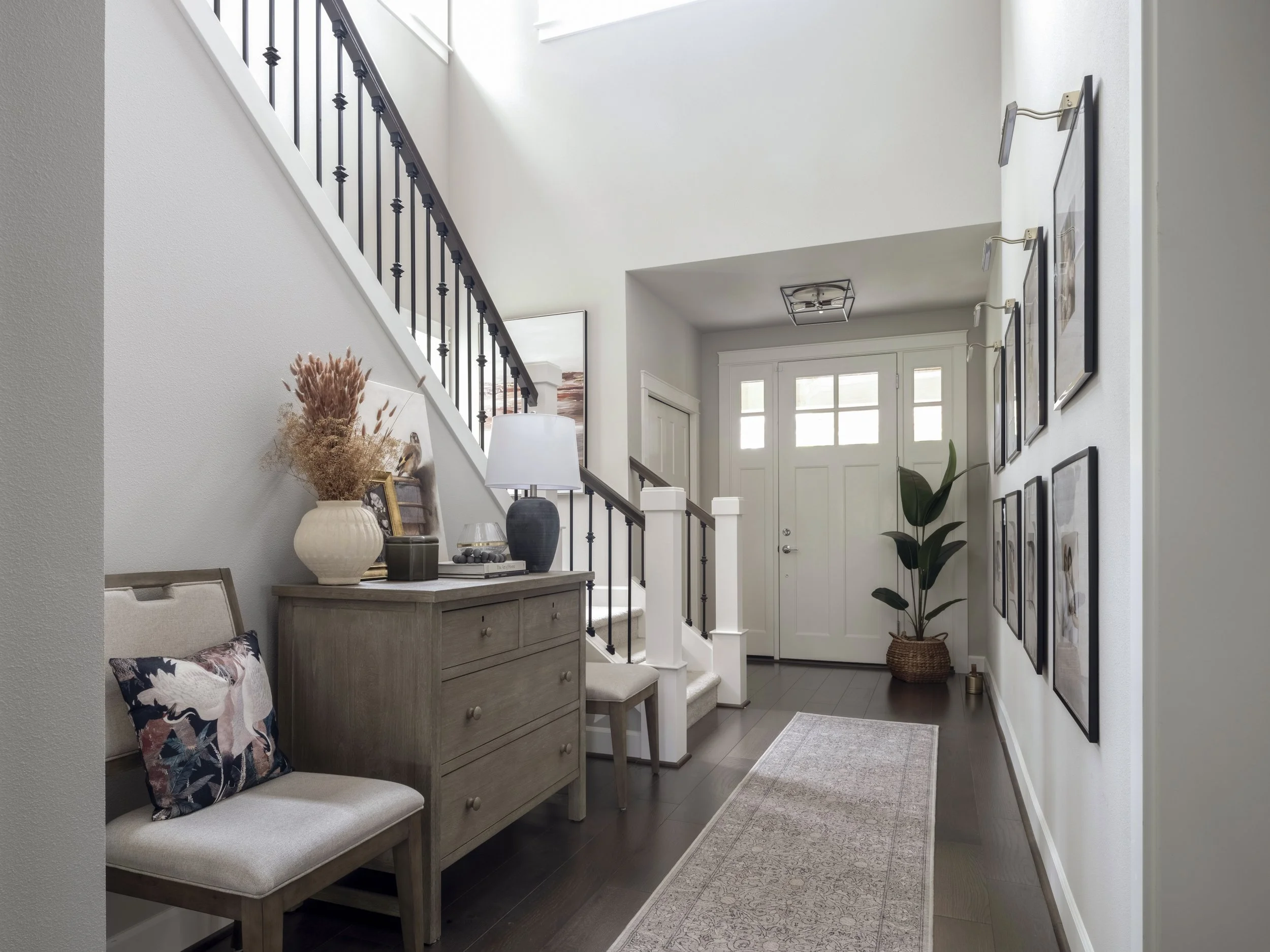
“Tired of the Front-Door Clutter? Try This Simple Landing-Zone Layout to Instantly Calm Your Entryway on Rainy Days.”
Wet coats, heavy boots, and umbrellas piling up at the front door? Discover how to design a highly functional, beautiful entryway drop-zone for busy Pacific Northwest rainy days.
The 15-Minute Mudroom: How to Build a Clean, Organized Landing Zone for Rainy Seattle Days
Let’s be completely honest for a second: there is nothing quite like that instant feeling of relief when you finally unlock your front door after a long, busy day. But if the very first thing you see when you step inside is a chaotic mountain of damp rain jackets, stray umbrellas, and heavy mud-flecked boots sprawling across your floor plan, that peaceful sigh of relief can turn into instant visual anxiety.
Living in areas like Kirkland, Bellevue, and across the Eastside means our wardrobes are heavily dictated by the shifting Pacific Northwest weather. Between our wet-weather layers, reusable grocery totes, gym bags, and daily essentials, our entryways are easily the hardest-working zones in the entire house.
If your home or condo opens up directly into a tight living space without a built-in mudroom, you might think you are stuck living with the clutter. But you do not need to construct a custom closet to fix your front door flow.
You can build a highly sophisticated, beautifully organized "landing zone" in under fifteen minutes using smart, non-construction space planning choices.
Here are the designer secrets to creating a clean, welcoming entryway drop-zone that swallows up daily clutter while keeping your home looking effortlessly pristine.
1. Anchor the Space with an Entryway Storage Bench
If you are shuffling sideways or balancing on one foot to slide off your boots when you walk through the door, your entryway footprint is working against you.
The Space-Planning Fix: Introduce a beautiful, streamlined wooden bench with a hollow, built-in storage base or lower open shelving. A dedicated seating piece instantly defines the perimeter of your entryway zone. It gives you a comfortable place to sit and transition out of your shoes while seamlessly concealing your daily footwear completely out of the main traffic lanes.
2. Take Advantage of Vertical Wall Space
When floor space is at a premium—especially in modern townhomes or urban condos—letting items pile up horizontally on tables or the floor will instantly suffocate the room's energy.
The Space-Planning Fix: Shift your storage strategy upward. Install a row of high-quality architectural wooden or matte brass wall hooks at varying heights. Hanging your heavy rain coats, umbrellas, and bags vertically draws the human eye upward, highlighting the height of your ceilings and instantly making your entryway feel significantly wider and airier.
3. Implement the Power of Enclosed Console Tables
If your current entryway features an open-legged console table with keys, mail, and charging cords scattered across the surface, it is contributing heavily to visual background noise.
The Space-Planning Fix: Swap out open shelving for an enclosed console table that features cabinets, deep drawers, or built-in cord management. This gives you a hidden operational center to tuck away trailing phone chargers, loose mail, dog leashes, and daily pocket items, keeping your main entry surfaces clean, intentional, and clutter-free.
4. Ground the Zone with a Durable Runner Rug
An open, uncarpeted floor right at the front door can feel visually cold and flat, making the entrance feel more like an institutional hallway than a welcoming home.
The Space-Planning Fix: Ground the entry path with a large, low-profile washable runner rug. Opt for a high-quality vintage traditional pattern or a rich woven texture in warm, cozy neutral tones. A durable runner acts like a visual welcome mat, absorbing water and debris from rainy days while instantly softening the transition from the outdoors to your indoor sanctuary.
5. Brighten the Entrance with a Geometric Mirror
Many entryway layouts are tucked into narrow hallways far away from the main windows, leaving the first impression of your home feeling a bit dim or enclosed.
The Space-Planning Fix: Hang a large, beautifully framed round or square mirror directly above your console table or next to your coat hooks. Ensure the frame uses light natural wood or warm brass tones to match your furniture finishes. The mirror acts like an architectural cheat code, catching whatever ambient daylight flows from your living room windows and bouncing it right back into the entry core, making your hallway feel twice as bright and twice as deep.
Create an Intentional First Impression
Your entryway sets the emotional tone for your entire home. It shouldn't feel like a chaotic storage locker—it should feel like a deep breath of fresh air. By making a few clever furniture swaps, taking advantage of your vertical space, and choosing high-performing, beautiful materials, you can create a safe, organized landing zone that supports your busy lifestyle.
At Simply Bold Design, we specialize in luxury, non-construction room refreshes, custom spatial planning, and family-friendly cosmetic upgrades across Seattle and the Eastside. We remove all the stress by delivering a personalized, beautifully detailed shopping list packed with clickable links to exclusive furniture and decor. You get a flawless, professional look executed seamlessly on your own terms.
Ready to clear the front-door clutter and unlock your entryway's true potential? Book a Discovery Call with Simply Bold Design Today and let’s design a space you love coming home to!
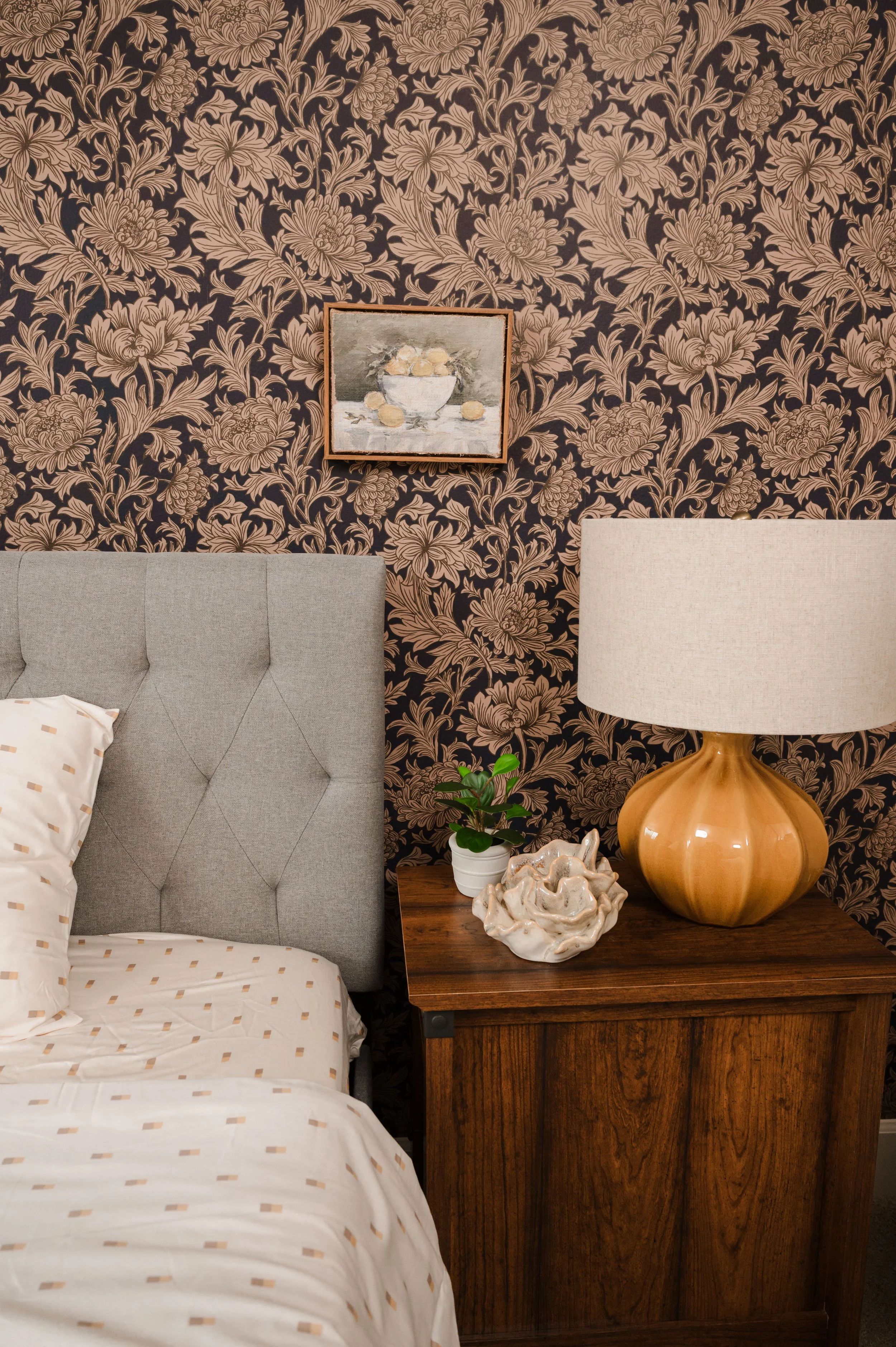
“Is Your Living Room Feeling a Little Cold? Try This Simple Multi-Textured Layering Trick to Warm Up Your Space Without Painting.”
Luxury rental came with sterile gray or cool white walls? Discover how to layer warmth, depth, and texture into a neutral space without picking up a paintbrush or violating your lease.
Are Your Neutral Walls Making Your Seattle Apartment Look Sad? How to Layer Warmth Without Painting
Let’s be completely honest for a second: there is a huge difference between a clean, minimalist neutral space and a room that feels a little cold, sterile, or uninspired. If you have recently moved into a luxury high-rise in South Lake Union, a modern townhouse in Bellevue, or an apartment in Kirkland, you probably walked into a home finished in a very common palette: crisp white trim, stark white walls, or cool, corporate gray.
Under a beautiful, bright California sun, those cool grays look sleek and modern. But back here in reality—underneath our beautiful, moody Pacific Northwest overcast skies—cool gray paint can take on a heavy, slightly blue undertone. Instead of feeling calming, it can make your home feel a little bit like a gloomy winter cloud.
If you are renting a premium space or living under strict HOA rules, painting over those neutral walls isn’t an option. But you don’t need color on the walls to bring life into a room.
You can completely banish that "sad apartment" feeling by mastering the art of warm neutral layering.
Here are the designer-approved, non-construction secrets to infusing your neutral space with deep warmth, rich soul, and high-end coziness—without picking up a single paintbrush.
1. Shift From "Cool" Neutrals to "Ripe Harvest" Tones
The biggest mistake people make with neutral walls is pairing them with more cool-toned furniture. If your walls are cool gray, adding a charcoal sofa and a slate-colored rug will visually collapse the room, absorbing whatever ambient daylight you get.
The Space-Planning Fix: Counterbalance the cool walls by introducing warm, sun-drenched earth tones into your furniture layout. Look for pieces in soft ivory, creamy beige, warm taupe, camel, and subtle terracotta. These warmer shades act like an automatic sunshine filter, catching the daylight and softening the room's entire atmosphere.
2. Layer Texture Like a Fashion Designer
When you are working with a limited color palette, texture becomes your substitute for color. A room with flat walls, flat leather furniture, and a flat rug will always feel cold because the human eye has nowhere to rest.
The Space-Planning Fix: Build a rich, multi-dimensional visual field using contrasting materials. Pair your sofa with highly texturized accents—think chunky woven blankets, plush bouclé accent chairs, raw linen drapery, and velvet throw pillows. Mixing textures creates soft shadows and depths that make a room feel instantly premium, tactile, and incredibly welcoming.
3. Bring in the Solar Energy of Polished Brass & Gold
Cool metals like chrome, brushed nickel, and polished stainless steel look incredibly clean, but they amplify the cold, metallic undertones of a gray or stark white apartment block.
The Space-Planning Fix: Pivot toward warm, reflective metals. Introduce brushed brass, antique bronze, or matte gold accents through your lighting fixtures, side trays, and picture frames. Warm metallic tones gracefully capture whatever ambient light is available in the room and reflect a soft, sunny glow that breaks up mental fatigue and visual stiffness.
4. Ground the Floor Plan with a Soft, Low-Profile Rug
If your condo came with dark hardwood floors or industrial concrete, it might be visually drinking up all your light and dragging the mood of the room down.
The Space-Planning Fix: Ground your main conversational seating area with a large, low-profile area rug in light cream or soft sand tones. Look for a subtle, organic geometric pattern or a rich, thick texture. A light rug acts like a giant canvas reflector on your floor, pushing light upward and making the whole room feel airier and significantly wider.
5. Elevate the Room with Golden Lighting Layers
Relying on a single, harsh overhead light fixture is the fastest way to make a neutral apartment feel clinical. To create a space that feels like a warm hug at the end of a long day, you need to rethink your bulb temperatures.
The Space-Planning Fix: Strictly avoid cool, blue-white lightbulbs in your relaxation zones. Equip your floor lamps and side table lamps with warm white LED bulbs. Opt for lamps featuring hand-woven rattan, wicker, or warm linen shades. When lit, the light filters through the natural fibers, casting beautiful, textured sunlit patterns across your neutral walls.
Fall in Love with Your Space Again
Your home should be an emotional sanctuary—a place that recharges your energy, sparks your willingness to work, and wraps you in comfort the moment you step through the door. You don’t need to knock down walls or break your lease to escape the gray. By fixing the visual flow, infusing warm natural textures, and layering the lighting, you can turn a blank canvas rental into a luxury, sunlit haven.
At Simply Bold Design, we specialize in luxury, non-construction room refreshes and renter-friendly cosmetic upgrades across Seattle and the Eastside. We remove all the stress by delivering a personalized, beautifully detailed shopping list packed with clickable links to exclusive furniture and decor. You get a flawless, professional look executed seamlessly on your own terms.
Ready to turn your neutral space into a warm, cozy masterpiece? Book a Discovery Call with Simply Bold Design Today and let’s make your design dreams a reality!
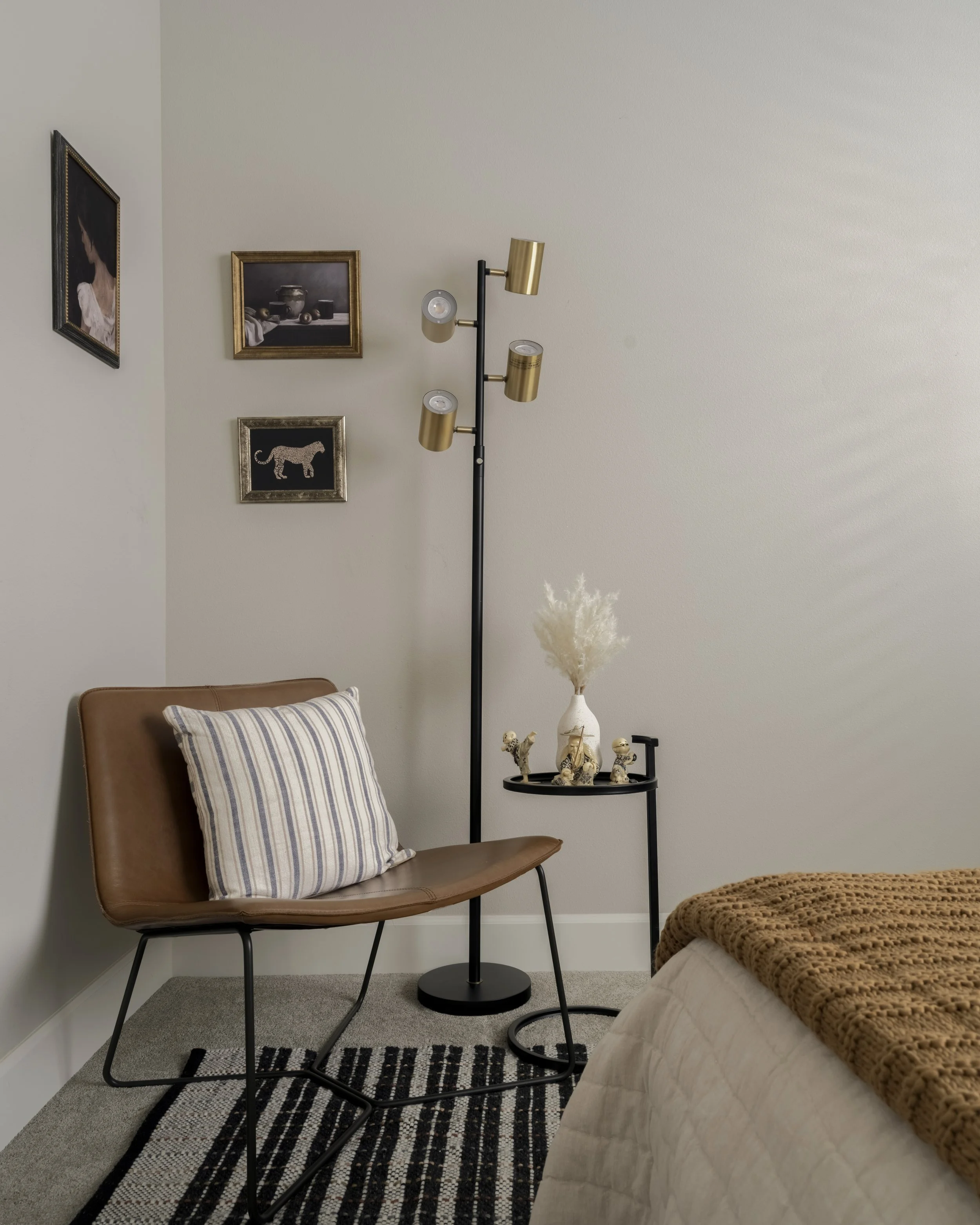
“Living Among the Trees? The Gentle Lighting Secrets to Lifting Deep Forest Shadows and Warming Up Your Interior.”
Tucked away in a beautiful, wooded Woodinville or Pacific Northwest lot? Discover the exact non-construction lighting blueprint to lift heavy tree shadows, brighten deep corners, and make your home feel bright and airy all year long.
Beyond the Overhead Light: The Exact Lighting Blueprint for Woodinville Homes Surrounded by Trees
There is nothing quite like the magic of living in Woodinville, Bothell, or the rolling hills of the Eastside. Coming home to a property wrapped in a lush canopy of soaring evergreens, majestic cedars, and vibrant maples provides an incredible sense of privacy, peace, and natural connection. It is the quintessential Pacific Northwest dream.
However, that beautiful, dense forest privacy comes with a hidden interior challenge. When your home is nestled deep among the trees, those magnificent branches cast deep, permanent shadows across your windows. Even on a bright summer afternoon, the natural light filtering inside can feel blocked, leaving your main living areas, entryways, and hallways feeling a bit heavy or dim.
If your space currently feels a little like a dark forest cave, you might think your only options are to hire tree-removal crews or cut open your roof for expensive, dusty skylight installations. But you don't need to change your exterior to brighten your interior.
You can completely transform the atmosphere inside your home using a styling-only, non-construction lighting blueprint.
Here are the designer secrets to lifting those heavy forest shadows, brightening deep corners, and making your tree-lined home feel beautifully sunlit and airy all year round.
1. Build a Three-Tiered Lighting Architecture
Relying entirely on a single, center-mounted ceiling light fixture is the fastest way to make a shaded room feel flat and dark. When light only fires from directly above, it creates harsh down-shadows underneath your furniture, accentuating the dim corners of the room.
The Design Solution: Think like a luxury interior stylist and distribute your light into three distinct tiers: ambient, task, and accent lighting. Place tall, sculptural floor lamps to cast a soft glow upward against your ceilings, introduce warm table lamps next to seating areas for reading comfort, and tuck slim LED accent strips under floating shelves or inside media consoles. Spreading your light sources horizontally completely erases deep corner shadows.
2. Introduce Textured, Sunlit Shades
In an enclosed or tree-shaded room, a completely solid metal or dark fabric lampshade will restrict light, forcing it to shoot strictly up or down in a harsh cone shape.
The Design Solution: Look for lighting fixtures featuring hand-woven rattan, wicker, or warm linen shades. When you illuminate these organic materials, the light filters gently through the textured fibers. This casts a rich, sunlit, dappled pattern across your dark walls, beautifully mimicking the missing solar energy and filling the room with an automatic sense of warmth.
3. Outsmart the Shade with "Sun-Drenched" Woods
When a home lacks direct natural sunlight, filling it with cool, reflective metals like chrome, polished steel, or dark charcoal finishes can make the space feel clinically cold or static over time.
The Design Solution: Bring the sun indoors through your furniture material choices. Swap out heavy, dark-stained wood or black metal tables for light-toned natural woods like light oak, birch, or bamboo. These lighter finishes acts like natural light-multipliers, catching whatever ambient daylight slips through the trees and introducing a soft, organic warmth that grounds your floor plan.
4. Swap Out Cool Grays for Ripe Harvest Neutrals
Many Pacific Northwest homes come finished with standard cool gray walls or stark white trim. Under a dense canopy of green trees, cool gray paint can take on a heavy, slightly blue-green cast that saps a room of its coziness.
The Design Solution: Shift your interior visual field toward warm, welcoming neutrals. Ground your main seating areas with a large, low-profile area rug in light cream, soft ivory, or warm sand tones. Layer your sofas with highly texturized fabrics—like chunky wovens, bouclés, and linen pillows. These rich, warm textures brighten the visual plane of the room, making it feel bright and inviting even on the dampest rainy days.
5. Create a "Virtual Window" with Strategic Mirrors
If you have a wall that sits completely in the dark because it is tucked away from the main windows, it can act as a giant shadow anchor, drawing energy down.
The Design Solution: Hang a large, beautifully framed round or square mirror on that darker wall, positioning it so it can capture a glimpse of the windows across the room. The mirror acts like an architectural cheat code, catching the green, outdoor view and whatever ambient light is available, then doubling it right back into the room's core layout.
Bring the Light Inside
Living in harmony with nature shouldn't mean living in the dark. By adjusting your lighting layers, selecting light-reflective natural materials, and clearing out the visual shadows, you can honor the beautiful evergreens outside while enjoying a bright, sun-drenched sanctuary inside.
At Simply Bold Design, we specialize in luxury, non-construction room refreshes and custom space-planning across Seattle and the Eastside. We remove all the stress by delivering a personalized, beautifully detailed shopping list packed with clickable links to exclusive furniture and decor. You get a flawless, professional look executed seamlessly on your own terms.
Ready to completely banish the shadows from your tree-lined home? Book a Discovery Call with Simply Bold Design Today and let’s craft a space that feels open, bright, and deeply cozy!
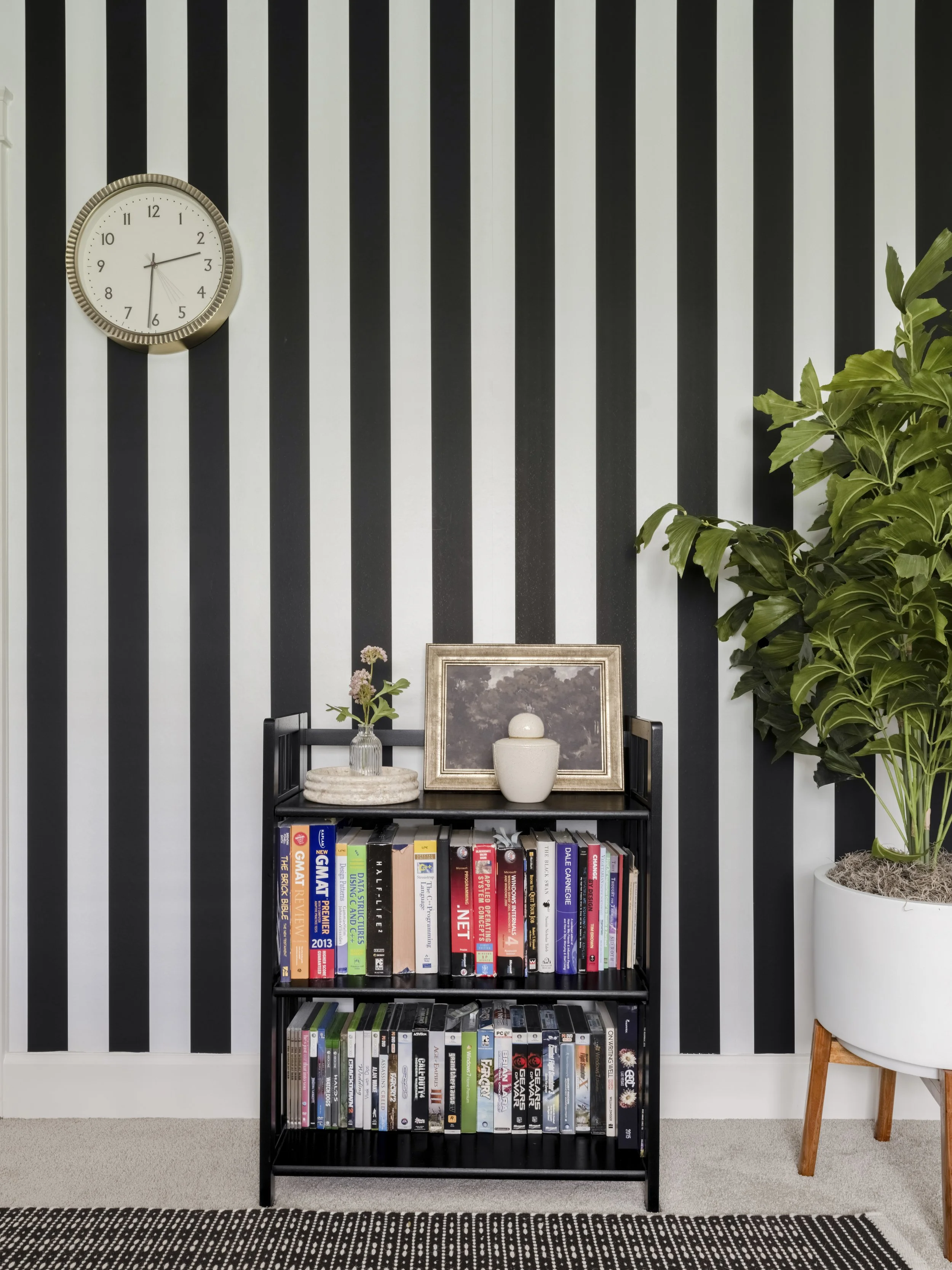
“The Two-in-One Space: How to Craft a High-Profile Home Office That Easily Softens into a Cozy Guest Oasis.”
Remote worker based in Redmond or Bellevue? Discover how to blend a high-profile executive office background and a luxury, welcoming guest room into a single, cohesive room layout without structural remodeling.
The Hybrid Hustle: How to Blend a Luxury Guest Room and a High-Profile Home Office in Redmond
If there is one thing that defines life across the Eastside - especially in tech hubs like Redmond and Bellevue - it is the modern art of the hybrid schedule. Many of us are balancing demanding executive roles from home while simultaneously striving to keep our living environments feeling peaceful, beautiful, and deeply personal.
But this hybrid lifestyle comes with a very common household puzzle: the multi-purpose spare room.
You need a sophisticated, clutter-free home office setup with a high-profile background that commands authority during your executive video calls. At the same time, you want that exact same room to feel like a warm, luxury hotel oasis when out-of-town family or friends come to visit.
Trying to force a bulky, corporate office desk and a traditional queen-sized bed into the same four walls usually leads to a space that feels visually crowded, emotionally confusing, and a little bit like a corporate storage locker.
The good news? You do not need to choose between a professional workspace and a welcoming guest room. With a few intentional, non-construction space planning choices, you can create a seamless double-agent space.
Here is the exact designer blueprint to help you blend a high-profile home office and a luxury guest room into one perfectly balanced retreat.
1. Build an Executive Video Backdrop
When you are on an important corporate presentation, your background communicates your personal brand identity to your team and clients. A blank wall or a bed sitting directly behind your chair can subtly blur the boundaries between your work life and your resting life.
The Design Solution: Position your main desk so that the backdrop behind your chair features structured, intentional design. A fantastic approach is to hang an elegant gallery wall collage to your right or directly behind you, featuring warm vintage world maps, minimalist architectural linework, and clean motivational quotes framed in light oak wood. This anchors your space with professional depth and keeps the resting elements of the room entirely out of the camera's sightline.
2. Embrace the Luxury Daybed or Sleeper Sofa Layout
A massive, traditional queen-sized bed frame sitting dead center in a multi-purpose room instantly claims the space as a bedroom first. This leaves you feeling like you are working out of a guest suite every single day.
The Design Solution: Swap out a traditional bed for a high-end, tailored upholstered daybed or a premium sleeper sofa wrapped in high-performing neutral fabrics. During the workweek, push it neatly against the wall and style it with structured linen throws and geometric pillows to make it look like a sophisticated office lounge area. When guests arrive, it easily opens up into a cozy, ultra-comfortable bed.
3. Layer the Lighting for a Soft Energetic Shift
Lighting is the ultimate tool for changing the mood of a room instantly. A home office requires crisp, bright light to keep you focused, while a guest bedroom needs a soft, amber glow to encourage deep relaxation.
The Design Solution: Introduce layers of light that you can adjust depending on the time of day. Keep daylight-balanced LED bulbs inside a sculptural desk lamp for your active working hours. For the ambient layers, add a beautiful table lamp featuring a hand-woven rattan or wicker shade on a side table. When the workday concludes, turning off the desk light and turning on the textured lamp instantly transforms the room from an energetic office into a peaceful, sunny evening sanctuary.
4. Hide the Cord Chaos with a Sleek Console Setup
Nothing breaks the calm, luxury aesthetic of a guest room faster than a web of black computer wires, power strips, and trailing chargers snaking across the floor plan.
The Design Solution: Use a slim, enclosed wooden console table right along the perimeter wall or directly behind a floating couch setup. Choose a model that features built-in wire management or closed cabinetry. This gives you a hidden operational center to tuck away all your necessary tech devices and power blocks, ensuring that when your guests unpack their bags, they are greeted by a pristine, clutter-free environment.
5. Ground the Space with Textural Warmth
Because Redmond townhomes and Bellevue condos often feature clean, modern white or cool gray walls, a multi-purpose room can sometimes feel slightly clinical if left unstyled.
The Design Solution: Bring in natural Pacific Northwest warmth through high-impact, cozy textiles. Place a large, soft cream or ivory low-profile area rug beneath your seating layout to define the space. Layer the furniture with rich, tactile textures like chunky woven blankets, boucle accent fabrics, and subtle earth-toned pillows. Mixing textures introduces a welcoming, artisan layer that makes both remote workers and overnight guests feel instantly comfortable.
Design with Dual Intention
Creating a truly functional hybrid room isn't about compromising; it is about designing with dual intention. When you fix the physical flow, clear out the tech clutter, and establish distinct visual zones, a single spare room can easily support your highest corporate ambitions by day and cradle your favorite people by night.
At Simply Bold Design, we specialize in luxury, non-construction room refreshes and family-friendly cosmetic upgrades across Seattle and the Eastside. We remove all the stress by delivering a personalized, beautifully detailed shopping list packed with clickable links to exclusive furniture and decor. You get a flawless, professional look executed seamlessly on your own terms.
Ready to completely transform your hybrid workspace? Book a Discovery Call with Simply Bold Design Today and let’s craft a space that works beautifully for you!
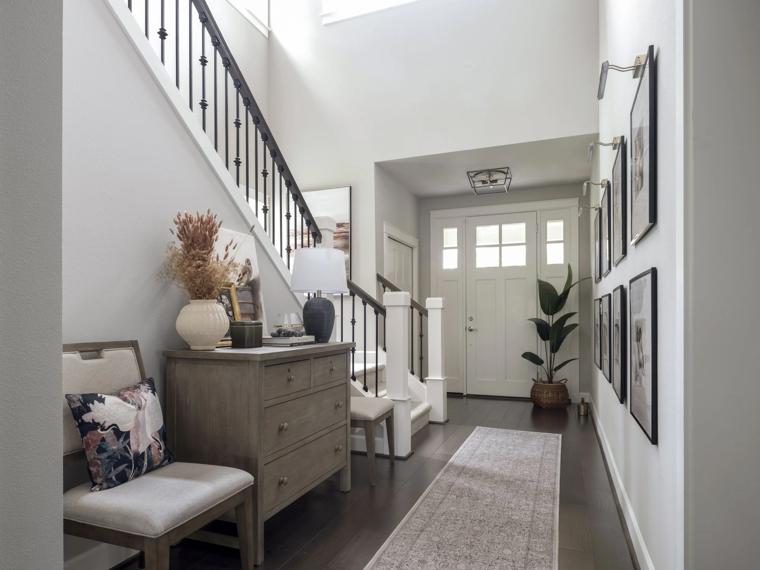
“The Narrow Townhome Secret: How ‘Floating’ Your Sofa Changes Everything for a Cozy PNW Flow.”
Living in a multi-story townhome in Bellevue, Redmond, or Seattle is amazing until you try to arrange your furniture. Discover 5 non-construction, space-planning secrets to instantly fix your awkward layout, maximize flow, and make your narrow home feel twice as wide.
Help! My Seattle Townhouse Layout Feels Totally Awkward: 5 Space-Planning Secrets
Let’s be completely real for a second: the Pacific Northwest townhouse layout is an architectural icon. They are sleek, they are modern, and having multiple floors means you get incredible zoning—not to mention those gorgeous rooftop views over Lake Washington or the Seattle skyline.
But when the moving truck drives away and you are left standing in your main living area with a sofa, a TV, and a coffee table, reality hits.
Many modern townhomes in Bellevue, Redmond, and Kirkland are notoriously narrow, long, and packed with tricky structural elements like floating staircases, large floor-to-ceiling windows, and oddly placed corner pillars. Trying to arrange standard furniture in these spaces can feel like a high-stakes game of Tetris. If you push everything against the walls, your room instantly feels like a long, narrow bowling alley. If you block the windows, you lose that precious natural PNW light.
The good news? You do not need to call a contractor to tear down walls or remodel your floor plan. Most homes don’t need new walls—they just need new intention.
Here are 5 designer-approved space planning secrets to instantly fix your awkward townhouse layout, unlock a seamless flow, and make your home feel twice as wide.
1. Stop Hugging the Walls: Floating Your Furniture
When dealing with a long, narrow living space, our natural instinct is to push every single piece of furniture flush against the drywall to save floor space. In a townhouse, this actually does the exact opposite—it highlights the narrow dimensions and leaves you with an awkward, empty canyon down the middle.
The Space-Planning Fix: Pull your main sofa or sectional away from the walls. Pulling it even 12 to 18 inches inward creates a "floating" layout. This immediately introduces a clear perimeter walkway behind the seating, tricking the subconscious mind into believing the room is significantly wider than it actually is.
2. Create Zones with Open-Back Bookshelves
If your main floor houses your living room, dining area, and kitchen all in one long, unbroken stretch, the space can easily feel chaotic. Without clear boundaries, visual noise bleeds from the kitchen counters straight into your relaxing lounge zone.
The Space-Planning Fix: Instead of putting up a solid wall divider, place a tall, open-back wooden or geometric metal bookshelf perpendicular to the wall. Because it has no solid back panel, it lets ambient daylight pass through seamlessly, keeping your windowless corners bright. It cleanly zones off your living room from the dining area while providing an elegant display for light ceramics, plants, and books.
3. Lean into Curvature to Break the Box
Most modern Pacific Northwest townhomes are a collection of sharp, clean, rigid lines. When your walls are square, your windows are rectangular, and your staircases are linear, adding a boxy square sectional and a rigid rectangular coffee table can make the entire space feel incredibly stiff.
The Space-Planning Fix: Soften the architecture by introducing rounded silhouettes. Swap out a rectangular coffee table for a large round ottoman or an organic-shaped wooden table. Opt for accent chairs with curved backs or a round dining layout. These soft edges naturally guide the eye through the room, eliminating that strict "corridor" feel and making traffic flow smooth and effortless.
4. Maximize Your Traffic Lanes
One of the biggest culprits behind an "awkward" feeling layout is a tight traffic lane. If you have to shuffle sideways past your coffee table or turn at an odd angle to avoid hitting the edge of a media console, your spatial planning is working against you.
The Space-Planning Fix: Maintain a strict minimum of 30 to 36 inches of clear walking space for your primary pathways. If a piece of furniture extends into that zone, it’s a sign that the scale is too large for the room. Switch to low-profile, leggy furniture silhouettes that sit higher off the floor. Slimmer profiles let light travel underneath, visually expanding the room's footprint.
5. Build Architectural Depth on the Short Walls
To make a long, narrow room feel more proportioned and square, you want to draw the human eye toward the shorter end walls rather than letting it slide down the long sides.
The Space-Planning Fix: Give the short wall at the far end of the room a major focal point. Hang your favorite oversized abstract art print with a wide mat border, design a cohesive gallery layout filled with global travel maps and positive quotes, or add a beautiful, texturized linen quote board. Creating a visual anchor at the far end pulls the eye forward, instantly balancing out the room's proportions.
Take Back Control of Your Space
Your home should be a place where you can breathe deeply and move effortlessly, not a space where you are constantly dodging furniture corners or fighting clutter. When you fix the flow and functionality of an awkward layout, your entire lifestyle shifts for the better.
At Simply Bold Design, we specialize in luxury, non-construction room refreshes and custom spatial planning across Seattle and the Eastside. We remove all the stress by handing you a beautifully curated, clickable shopping list filled with exclusive, designer-approved furniture and decor pieces so you can execute a flawless transformation flawlessly on your own terms.
Ready to say goodbye to your awkward townhouse layout for good? Book a Discovery Call with Simply Bold Design Today and let’s turn your space into a perfectly balanced, stylish haven!
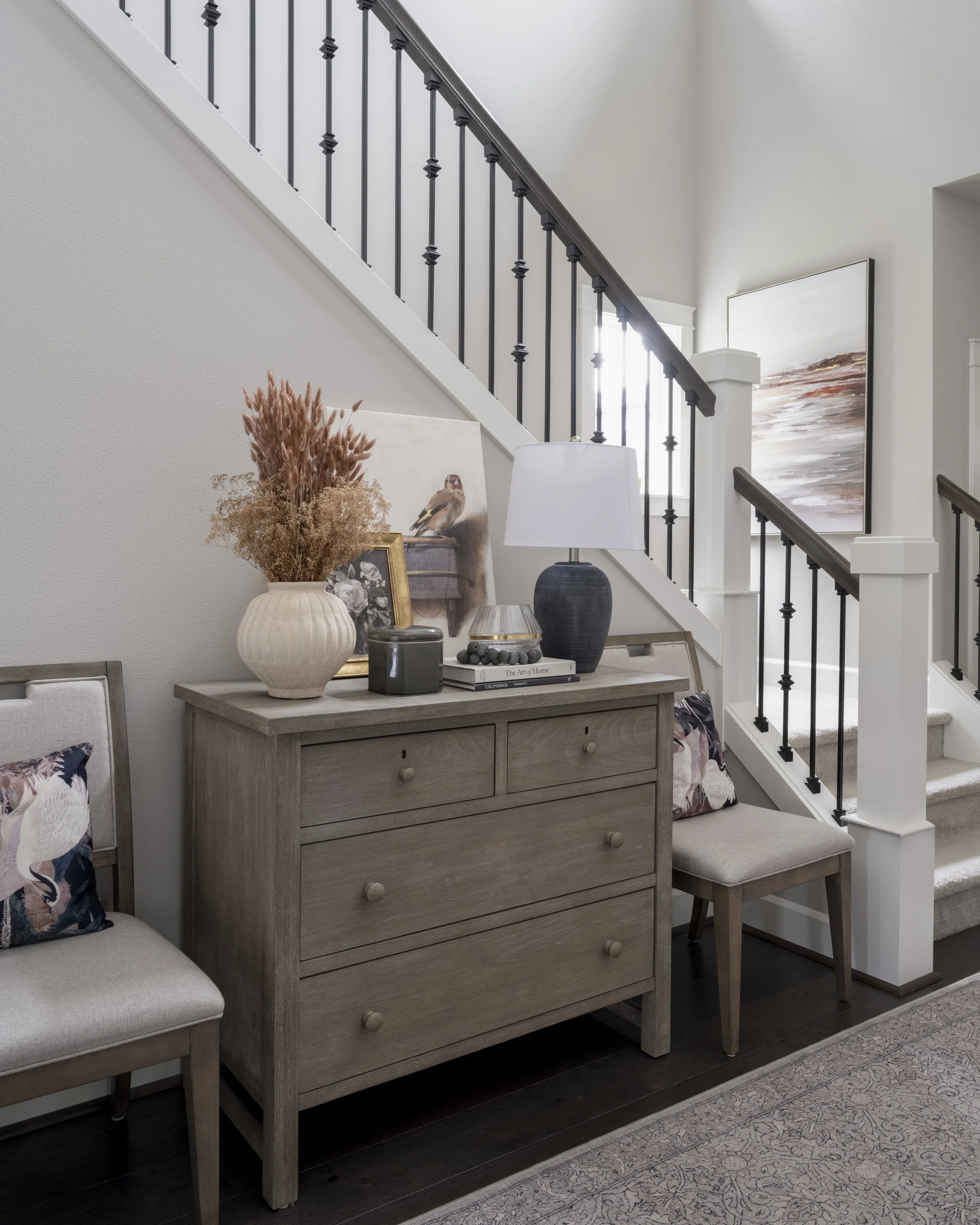
“The Seattle Square-Foot Struggle: 8 High-Impact Ways to Hide Your Clutter in Plain Sight”
Maximize your Pacific Northwest square footage without the mess or delays of remodeling. Discover 8 stylish, non-construction hidden storage hacks—including covert concealment shelves and multi-tasking coffee tables—to hide daily clutter in plain sight.
Hidden Storage Secrets: 8 Genius Ways to Unclutter Your Seattle Home (Without Remodeling)
Let’s be completely honest for a second: we live in one of the most beautiful corners of the world, but local real estate requires some serious spatial strategy. Whether you are coming home to a sleek, modern condo in South Lake Union, a cozy townhouse in Bellevue, or a classic craftsman in Kirkland, space is premium property.
Our local builders do a fantastic job designing clean, streamlined layouts to maximize our gorgeous views. But between our rain gear, tech gadgets, kid toys, and life essentials, it doesn’t take much for a room to feel a little crowded.
The good news? You do not need to pack your bags, knock down walls, or live through construction dust. The secret to a calm, magazine-worthy home isn't having less stuff, it's mastering the art of hidden storage.
Here are 8 designer-approved, non-construction storage secrets to hide your clutter in plain sight, keep your space flowing, and protect your sanity.
1. The Multi-Tasking Lift-Top Coffee Table
Your coffee table shouldn't just hold mugs; it should work for a living. A lift-top coffee table features a mechanical surface that smoothly lifts up and forward to meet you at sofa height.
The Hidden Benefit: Beneath that beautiful wooden top sits a deep, secret compartment. It is the absolute perfect place to hide board games, laptops, work notebooks, or kid art supplies. When you close it, your living room layout looks instantly pristine and ready for company.
2. Built-In Sofa Base Storage
Sofas take up the largest footprint in your living room, so why not make them double agents for storage? Many modern sectional models now feature hidden, hydraulic compartments built right beneath the chaise or seating cushions.
The Hidden Benefit: It gives you a massive, dust-free home for oversized weighted blankets, extra winter linens, or your kids' favorite plush toys. You get all the comfort without sacrificing an inch of extra floor space.
3. Smooth Under-Bed Drawers
The space directly beneath your bed is one of the most underutilized zones in the entire house. Instead of shoving plastic bins under the bed frame, look for beds with built-in, integrated drawers or deep hydraulic lift platforms.
The Hidden Benefit: This is an elite trick for maximizing square footage in smaller Redmond or urban Seattle apartments. It acts exactly like a secondary dresser, smoothly concealing seasonal clothing, heavy winter coats, or extra pillows completely out of sight.
4. Secret Compartment Side Tables
If your current bedroom nightstands or living room end tables are just flat surfaces with open metal legs, they might be contributing to visual noise. Swap them out for solid, enclosed side tables that feature cabinets or drawers.
The Hidden Benefit: They provide a quiet, discreet space to tuck away trailing phone chargers, reading books, remotes, and nighttime essentials. Keeping these surfaces clean immediately lowers your stress levels before you sleep.
5. Multi-Functional Storage Ottomans
An ottoman is a true triple threat: it functions as a footrest, extra seating when friends visit, and a massive storage chest. Look for upholstered round or rectangular ottomans with removable or hinged lids.
The Hidden Benefit: Because they are soft and round, they are exceptionally family-friendly for homes with energetic kids. Toss in throw blankets, pillows, or quick-pickup toys right before your Zoom calls to reset the room's energy in seconds.
6. The Concealment Floating Shelf (The Ultimate Magic Trick)
Floating shelves are a designer staple, but this isn't just an ordinary wall accent—it is a total spatial illusion. At a glance, it looks like a sleek, ultra-minimalist white floating shelf displaying elegant decor.
The Hidden Benefit: With a quick, secure release, the bottom section of the shelf drops down to reveal a felt-lined, deep concealment compartment completely hidden from plain view. This is an elite option for urban Seattle condos and modern townhomes where floor space is at a premium and bulky safes just won't fit the vibe. It provides an entirely covert, secure zone right on your wall to neatly tuck away high-value items, passports, or confidential documents, keeping your home surfaces beautifully streamlined.
7. The Ultimate Entry Bench Storage
Pacific Northwest weather means we have a rotating collection of rain jackets, heavy boots, umbrellas, and reusable grocery totes. Without a designated landing pad, the front door zone can descend into chaos.
The Hidden Benefit: A beautiful wooden entry bench with a hollow storage base creates a structured, organized drop-zone. It gives you a comfortable place to sit and slide off your boots while instantly swallowing up the daily visual noise of a busy schedule.
8. The Clever Behind-Sofa Console Table
If your sofa floats in the middle of the room rather than sitting against a wall, you have a prime storage opportunity. Placing a slim, closed console table directly against the back of the couch changes everything. [1]
The Hidden Benefit: Look for consoles with built-in power outlets and hidden cabinets. This gives you a hidden operational center to plug in your devices, conceal messy tech wires, and store remotes without cluttering up your main living room surfaces.
Create Room for What Matters Most
At the end of the day, a beautiful home isn't about achieving a sterile, unlived-in perfection. It’s about designing a space that supports your daily lifestyle, grounds your family, and feels like a deep breath of fresh air every time you step through the front door.
At Simply Bold Design, we specialize in luxury, non-construction room refreshes, custom spatial planning, and high-impact storage layouts across Seattle and the Eastside. We remove all the stress by delivering a personalized, beautifully detailed shopping list packed with clickable links to exclusive furniture and decor. You get a flawless, professional look executed seamlessly on your own terms.
Ready to clear the clutter and unlock your home's true potential? Book a Discovery Call with Simply Bold Design Today and let’s design a space you love coming home to!
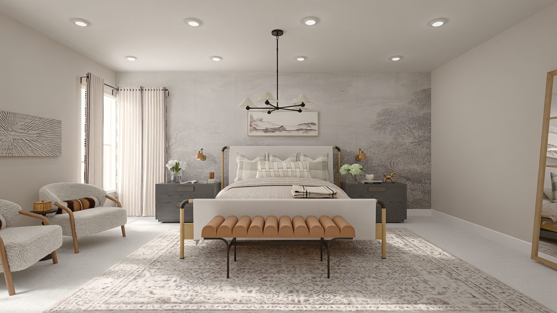
“Is a Fast-Paced Corporate Schedule Ruining Your Sleep? Try This Simple Bed Positioning and Lighting Shift to Turn Your Bedroom into a Restful Executive Retreat.”
High-intensity corporate schedule draining your energy? Discover 4 non-construction space planning secrets to rearrange your bedroom layout, banish subconscious stress, and build an elite executive sleep sanctuary.
The Sleep Sanctuary: How Your Bedroom’s Layout Can Drastically Reduce Daily Executive Stress
Let’s be completely honest for a second: navigating a demanding executive, tech, or business leadership role across the Eastside is an exhilarating journey. Managing high-stakes projects in Redmond, launching new initiatives in Bellevue, and keeping up with corporate deliverables requires an incredible amount of daily mental endurance and sharp, rapid decision-making.
But a fast-paced professional lifestyle comes with a very common household side effect: the hyper-stimulated brain.
When you finally shut down your laptop and step into your primary bedroom at night, your physical surroundings dictate how fast your nervous system recovers. If your bed layout sits directly in view of a messy work desk, if tech cords tangle across your floor plan, or if your room has become a chaotic holding zone for loose laundry and unorganized storage boxes, your subconscious brain stays on active alert. Instead of feeling like a peaceful sanctuary, your room secretly feeds your daily executive stress and accelerates professional burnout.
The great news is that you don't need a massive structural extension or a long home renovation project to build a deeply restful environment. You can completely lower your stress levels using strategic, styling-only space planning.
Here are 4 designer-approved secrets to rearranging your bedroom layout, clearing out mental fatigue, and crafting an elite executive sleep sanctuary.
1. Position Your Bed for Ultimate Spatial Safety
Where your bed rests on your floor plan has a massive psychological impact on how deeply you sleep. If your headboard sits on the same wall as your entry door, or directly beneath a large, drafty window, your subconscious mind spends the night micro-stressing about the lack of visibility or security.
The Space-Planning Fix: Place your bed in a commanding layout position. Arrange it so your headboard rests securely against a solid interior wall, giving you a clear, direct view of the entry door and the main room footprint without being directly in line with the doorway path. This layout creates an instant feeling of architectural safety and boundary control, allowing your nervous system to fully let go of the workday and slide into deep, restorative sleep.
2. Hide Corporate Reminders with Enclosed Bedside Storage
Nothing breaks the calm, luxury aesthetic of a rest zone faster than seeing phone charging cords, tech accessories, and half-read industry business journals sprawling across your nightstands right before you close your eyes.
The Space-Planning Fix: Cleanse your immediate visual field by replacing open-legged tables with fully enclosed, solid wooden nightstands. Look for designs featuring deep, quiet drawers or clean slatted wood doors. This gives you a dedicated, hidden containment system to completely tuck away trailing power blocks, eyeglasses, and reading materials out of sight. Keeping these top surfaces entirely immaculate removes visual clutter, helping your mind naturally transition from active work to quiet rest.
3. Layer Soft, Dappled Lights to Reset Your Internal Clock
Relying entirely on a single, uniform overhead ceiling light fixture or bright, cool-white recessed down-lights is the fastest way to trigger a late-night spike in corporate alertness, tricking your brain into thinking it's still noon at the office.
The Space-Planning Fix: Switch off the harsh overhead lights as soon as you enter the room to wind down. Instead, scatter a layered network of ambient accent lighting. Use a pair of sleek, vertical plug-in wall sconces flanking your bed, or place table lamps featuring shades crafted from hand-loomed grasscloth, woven jute, or thick matte ceramic bases. Equip every single fixture with warm white LED bulbs. When illuminated, the soft, warm light filters gently, casting quiet sunlit patterns across your walls that mimic a setting sun and signaling to your brain that it is safe to rest.
4. Ground the Bed Footprint with a Calming Textured Grid
If your bedroom features slick, cold hardwood floors or high-contrast modern carpeting, the visual field can look a bit unanchored and institutional under our classic Pacific Northwest overcast winter skies.
The Space-Planning Fix: Lock in a deep sense of luxury and structural comfort by placing a massive, low-profile area rug in soft oatmeal, light ivory, or warm clay tones directly underneath the bottom two-thirds of your bed frame. Choose a rug featuring a thick, tightly looped wool or a beautifully soft raised cross-weave texture. A large, plush neutral rug acts like a comforting visual canvas on your floor, dampening room acoustics while providing a soft, tactile cloud for your feet to land on every morning and evening.
Honor Your Rest, Protect Your Ambition
True interior luxury isn't a frivolous indulgence, it is a vital operational strategy for a high-performance life. Your bedroom shouldn't function as a chaotic storage locker or a secondary office branch; it should be a beautifully zoned escape that actively repairs your peace of mind. By prioritizing proper bed positioning, investing in enclosed storage furniture, and layering soft, natural light textures, you can design a high-end personal retreat that shields your mental clarity and welcomes you home to total comfort.
At Simply Bold Design, we specialize in luxury, non-construction room refreshes, custom spatial planning, and elite residential upgrades across Seattle and the Eastside. We remove all the stress by delivering a personalized, beautifully detailed shopping list packed with clickable links to exclusive furniture and decor. You get a flawless, professional look executed seamlessly on your own terms.
Ready to conquer your daily stress and unlock your bedroom's true potential? Book a Discovery Call with Simply Bold Design Today and let’s design a space you love waking up in!
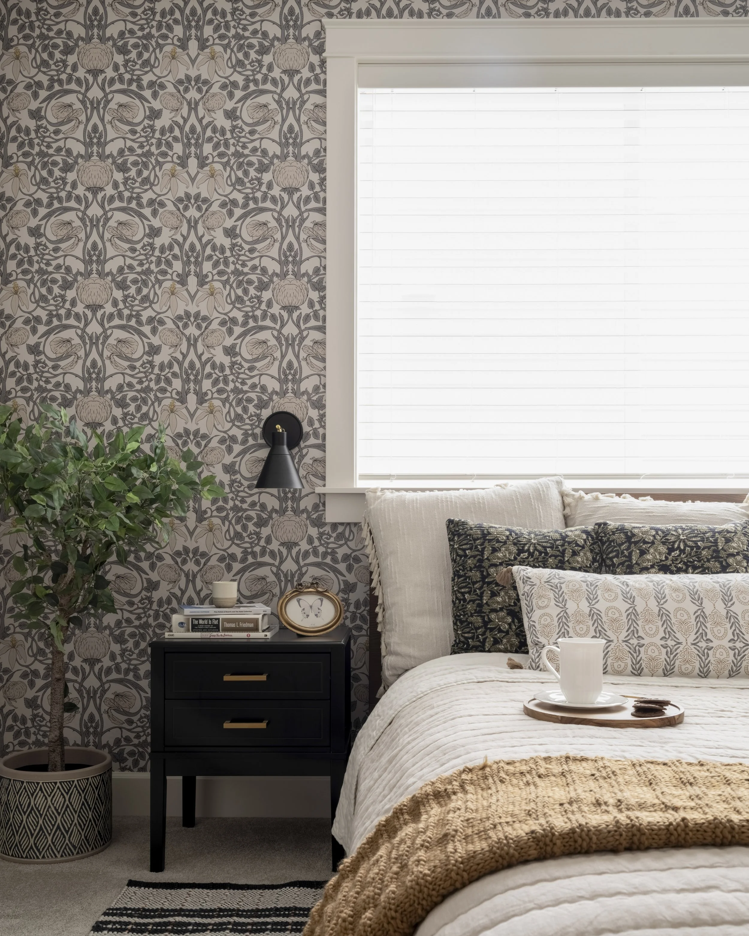
“All the Glow-Up, None of the Dust: Why No-Remodel Interior Design is Taking Over the PNW”
Want a dramatic home transformation without the dust, permits, or delays of a traditional renovation? Discover what no-remodel interior design is and how this styling-only approach creates luxury, sunlit spaces for Seattle and Eastside homeowners.
What Is No-Remodel Interior Design? (Seattle + Eastside Homeowner Guide)
Let’s be completely honest for a second: we have all watched those home renovation TV shows where a contractor casually swings a sledgehammer through a drywall partition, smiles, and promises a dream home in "just a few weeks."
But back here in reality, specifically in Seattle, Bellevue, Kirkland, and Redmond - the actual reality of a traditional home remodel looks a lot more like endless permit delays, eye-watering contractor quotes, living out of takeout boxes, and breathing in drywall dust for six months straight.
If you love your current neighborhood but your home’s layout feels a little stuck, heavy, or outdated, you might think a chaotic construction project is your only option. Spoiler alert: It isn’t.
Enter No-Remodel Interior Design.
This modern, high-impact approach completely transforms your space without a single permit, demolition crew, or structural headache. Instead of tearing down physical walls, the magic happens by optimizing everything inside those walls - layout flow, furniture scale, lighting architecture, rich textiles, and curated decor. It is the fastest, smartest way to make your Pacific Northwest home feel entirely brand new without disrupting your daily life.
Why No-Remodel Design is a Game-Changer for the PNW
Living on the Eastside or in downtown Seattle comes with a very specific set of lifestyle and architectural challenges:
The Big Dark: Our long, cloudy winters can make even the most beautiful homes feel dark and visually heavy.
High-Rise & Condo Layouts: Luxury apartments in Bellevue or tech-adjacent townhomes in Redmond often have strict HOA guidelines that completely ban major construction.
The Construction Standstill: Local contractor waitlists are long, and let's face it - busy families and remote tech workers can't just pause their lives to camp out in a construction zone.
No-remodel design solves every single one of these friction points. It delivers a dramatic, magazine-worthy face-lift on a highly efficient timeline.
How No-Remodel Design Works: The Blueprint
When you strip away the dust and demolition, you unlock a highly sophisticated design methodology. Here is the exact framework we use to elevate a home:
1. Strategic Layout Replanning
Most rooms don’t actually need new walls - they just need a completely new flow. By reworking your spatial footprint, we can instantly eliminate awkward traffic patterns, maximize floor space, and make a room feel twice as large and calm.
2. Masterful Furniture Curation
Scale is everything. Bulky, ill-fitting furniture drinks up light and creates awkward shadows. Selecting pieces with the perfect proportions, clean lines, and elevated legs creates an immediate sense of structural balance and luxury.
3. PNW-Specific Color Strategy
Because our natural daylight fluctuates wildly throughout the year, wall colors can shift from cozy to clinical in an instant. We leverage warm neutrals, rich layered tones, and light-reflective palettes specifically curated to combat the gloomy Seattle gray.
4. High-End Lighting Architecture
If a home feels flat or uninspiring, it is almost always a lighting issue. We swap out single, sterile overhead fixtures for rich layers of light - using sculptural floor lamps, task lighting, and smart accent strips to give your space an instant premium glow.
5. Tactile Textiles & Fine Styling
Rugs, custom throw pillows, breezy window treatments, and intentional decor accessories are the elements that bring the soul into a house. Mixing high-impact textures brings warmth and a cohesive identity to the entire floor plan.
6. Smart, Renter-Safe Upgrades
Perfect for high-end luxury rentals or temporary corporate housing: we use damage-free solutions like plug-in wall sconces, floating storage, removable statement panels, and highly portable premium furniture layout strategies.
What No-Remodel Design Is NOT
To clear up any confusion, when you choose a styling-only transformation, your project will involve absolutely ZERO:
Demolition crews or jackhammers
City permit applications or structural waitlists
Dust, debris, or hazardous fumes
Packing up your life to move into a temporary hotel
Unexpected structural supply-chain delays
It is total spatial transformation through intentional design, completely bypassing the construction chaos.
Who This Approach is Perfect For
This design philosophy is tailor-made for Seattle and Eastside residents who want:
A stunning, designer-curated home aesthetic without the high cost of structural renovation.
A rapid, seamless transformation that wraps up beautifully in 4 to 12 weeks instead of half a year.
A cozy, modern Pacific Northwest aesthetic that maximizes comfort during the winter months.
Clever small-space and entryway storage optimization for modern townhomes and urban condos.
The Final Verdict: New Flow, New Intention
At the end of the day, most homes don’t need structural changes to feel incredible, they just need new intention. When you fix the visual flow, the daily functionality, and the lighting energy of a room, the entire atmosphere shifts. You get the fresh start you’ve been craving, completely skipping the renovation anxiety you’ve been actively avoiding.
Is Your Space Ready for a No-Demo Glow-Up?
Whether you have an awkward living room layout that feels cluttered, a dark downtown condo that desperately needs brightness, a home office screaming for an executive, Zoom-ready backdrop, or a toddler's bedroom begging for structured creativity - we are here to help.
At Simply Bold Design, we specialize in luxury, non-construction room refreshes across Seattle and the Eastside. We remove all the guesswork by delivering a personalized, beautifully detailed shopping list packed with clickable links to exclusive furniture and decor. You get a flawless, professional look executed seamlessly on your own terms.
Ready to unlock your home's true potential? Book a Discovery Call with Simply Bold Design Today and let’s create your dream space!
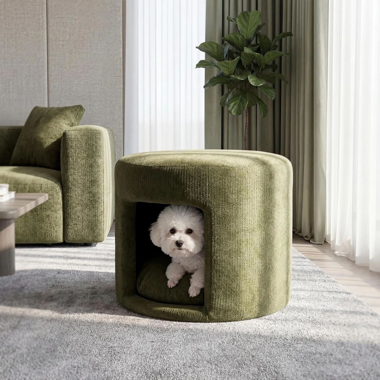
“Love Your Pet but Missing Your Minimalist Aesthetic? Try These 4 Non-Construction Design Swaps to Create a Luxurious, Fully Pet-Proof Space.”
Love your pet but hate when chew toys and bulky pet crates crash your high-end design? Discover 4 stylish, non-construction design secrets to craft a luxurious, pet-friendly home.
Paws and Polished Style: How to Design a Luxury, Pet-Safe Living Room in Kirkland
Let’s be completely honest for a second: the Pacific Northwest is an absolute paradise for pet parents. Whether you are walking your dog along the Kirkland waterfront, exploring the wooded trails of Marymoor Park, or just grabbing a casual weekend coffee on the Eastside, our furry companions are a massive part of our daily lives and family structures.
But as much as we love our pets, welcoming them into our living rooms often introduces a very real interior design dilemma.
Traditional pet products—like clunky plastic food dishes, oversized neon chew toys, and bulky fabric crates—have a tendency to completely clash with a clean, sophisticated home aesthetic. Before you know it, your carefully curated luxury townhome or craftsman house can start to feel less like a relaxing sanctuary and more like an indoor pet boutique.
The common misconception is that you have to choose between a beautifully styled space and a happy, comfortable pet. But you don't need to sacrifice your personal style for your pet's comfort.
You can design a high-end, elegant home that effortlessly withstands muddy paws, stray fur, and active playtimes using entirely styling-only, non-construction furniture choices.
Here is the designer blueprint to crafting a luxurious, pet-safe living room layout that keeps your style polished and your best friend completely at home.
1. Source High-End, Scratch-Resistant Performance Fabrics
Your sofa is the visual crown jewel of your living room footprint. If you are constantly hiding your upholstery under blankets to protect it from muddy paws, claw scratches, or shedding fur, your furniture layout is causing unnecessary stress.
The Space-Planning Fix: Swap out delicate, loose-weave fabrics for premium commercial-grade performance fabrics (such as high-end Crypton, tight-weave microfibers, or tightly woven flat-weaves). Performance fabrics are engineered at the fiber level to resist moisture, repel stains, and completely prevent claws from snagging. Fur easily lifts off the surface with a quick vacuum, allowing you to maintain a pristine, light-colored sofa layout even with pets.
2. Master the Art of Concealed Pet Storage
Pets accumulate a surprising amount of gear—from leashes and grooming supplies to chew toys and supplemental wellness treats. Leaving these items scattered across your open shelving or floors creates massive background visual noise.
The Space-Planning Fix: Integrate your pet's essentials directly into your hidden furniture storage systems. Use a beautiful, enclosed wooden entry bench or a closed console cabinet right by the front door to neatly tuck away leashes and outdoor towels out of sight. In the main lounge area, place a large, textured woven basket with a secure fitted lid on the floor. It gives your pet easy access to their toys during the day, while allowing you to completely clear the floor plan in under two minutes before clients or guests arrive.
3. Elevate the Footprint with Seamless, Functional Beds
Standard pet beds are often made from flimsy, bright materials that instantly break the color flow of a room, looking like a random afterthought dropped onto your dark hardwood floors.
The Space-Planning Fix: Treat your pet's bed as a real, intentional piece of furniture. Look for elevated pet beds crafted from light natural oak, walnut, or bamboo frames that match your existing side tables and consoles. Select custom cushion inserts wrapped in warm neutral textiles—like light ivory, cream, or warm taupe bouclé. Elevating the bed off the floor lets ambient light pass underneath, keeping the layout feeling airy and luxurious.
4. Swap Out Clinical Plastics for Artisan Ceramic Dishes
Feeding zones are a daily necessity, but placing mismatched plastic or metallic bowls directly in the middle of your kitchen or dining walkway can disrupt the visual transition between your rooms.
The Space-Planning Fix: Elevate your pet’s dining layout by replacing plastic dishes with hand-thrown artisan ceramic or solid marble bowls. Place them neatly on a small, low-profile silicone mat matching your floor tone, or tuck the feeding station into a custom, low-profile niche underneath an enclosed side console. Using natural, heavy stone finishes prevents the dishes from sliding around, protects your floors from water splashes, and complements your home's premium design aesthetic.
A Beautiful Home for the Whole Family
True interior luxury isn't about creating a fragile, unlived-in museum space. It’s about designing a highly functional, resilient environment that beautifully supports the lives of everyone inside it—including our four-legged family members. When you select high-performing materials, invest in hidden containment furniture, and align your finishes, you can enjoy the peace of a perfectly styled home alongside the joy of a happy pet.
At Simply Bold Design, we specialize in luxury, non-construction room refreshes, custom spatial planning, and family-friendly cosmetic upgrades across Seattle and the Eastside. We remove all the stress by delivering a personalized, beautifully detailed shopping list packed with clickable links to exclusive furniture and decor. You get a flawless, professional look executed seamlessly on your own terms.
Ready to clear the clutter and unlock your pet-friendly home's true potential? Book a Discovery Call with Simply Bold Design Today and let’s design a space the whole family loves!